Context
Approach
Vision
Concepts
Process
Scenarios
Prototyping
Additional
Learnings
Impact
TOP
BACK
Prosperous Universe is a space economy simulator MMO (Massive Multiplayer Online) game developed by a small independent game studio located in Germany.
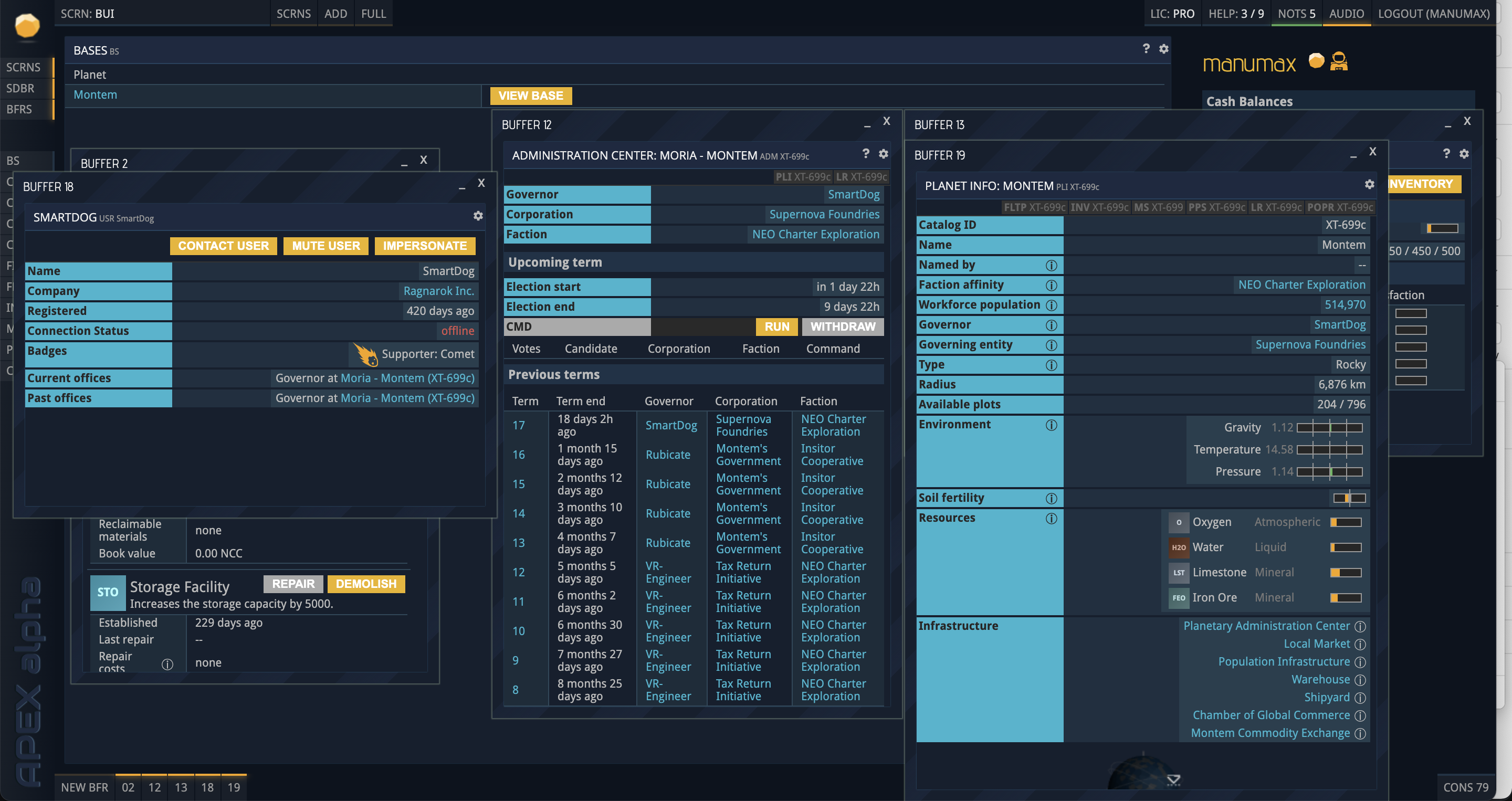
Prosperous Universe has a unique UI of crowded tables, drag and drop interactions and 3D maps.The game is essentially played on the web browser on a desktop with multiple screens. Expert gamers would often prefer to access all the data from the tables with a simplified Mobile interface and perform important transactions. All of the familiar game interactions and screens being adapted to simplistic mobile interface brings its own challenges.
Product designer
Martin (Product Owner),
Michael (CTO),
Nick (Marketing Manager)
THE APPROACH
Truly agile
A small,nimble and a remote team of 5 people consisting of a Game designer, a UX Designer, couple of Developers and a Marketing manager
we are truly agile. With every week scrum meetings moving the cards on the Kanban board we assess the complexity of the stories and tasks.
I had 6 major tasks to be accomplished:
1. Adapt the game web UI to Mobile UI
2. Create a brand new website for the game.
3. Create a dashboard and admin hub for the game.
4. Create a design system.
5. Adapt the existing game web UI to the new design system.
6. Present concepts for the remodelled game web UI.
I performed several iterations of design sketches perfecting the user journey and different states of the interaction. After arriving at a satisfactory solution, I designed the wireframes to be reviewed by the team. For the website, I presented a theme and designed an interface concept.
VISION
Simplistic interactions
We wanted to simplify the interactions on the mobile interface for the gamer to achieve important
transactions with minimal effort. We wanted to maintain a similarity by keeping common color scheme
and the sci-fi theme.
The website has to be contemporary maintaining a game theme and be able to tell the story, give out
information on the development roadmap and allow gamers to easily purchase the licenses.
BRAINSTORMING
Asking questions
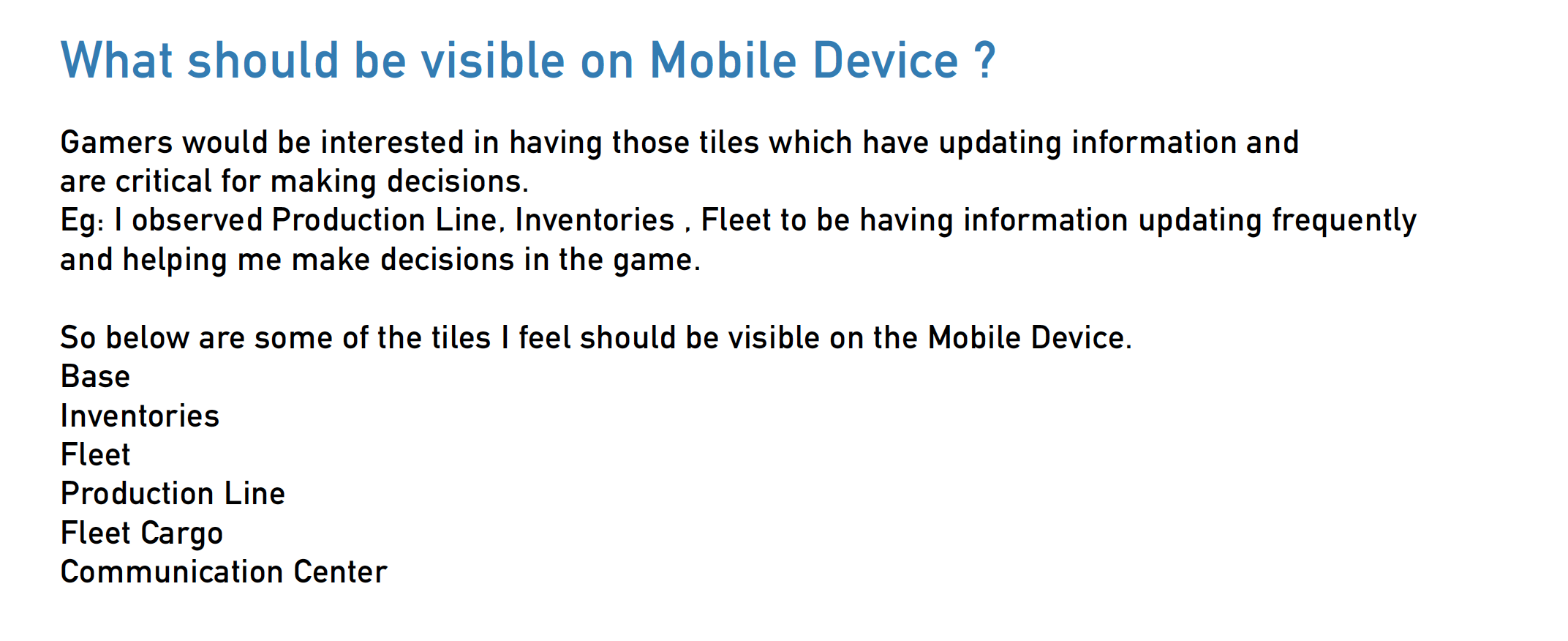
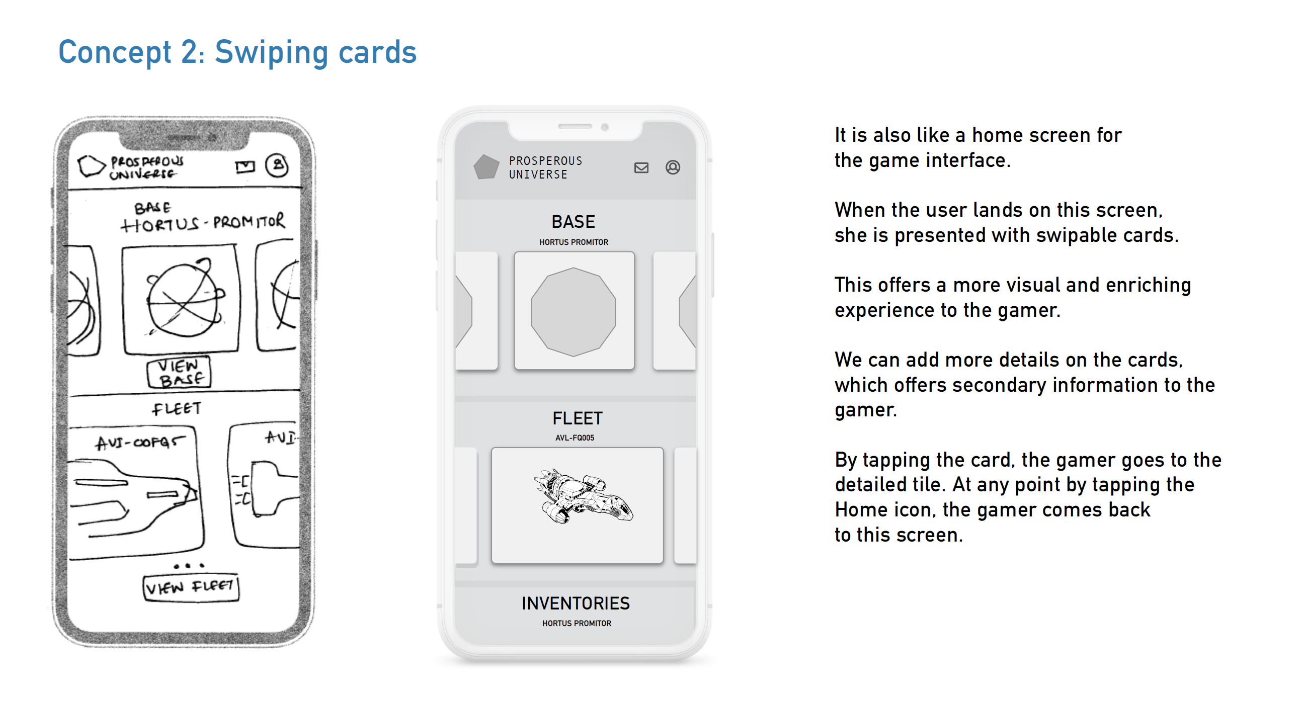
We wanted to go for a tile interface, because it is a folder structure and the ease of access is important.

CONCEPTS
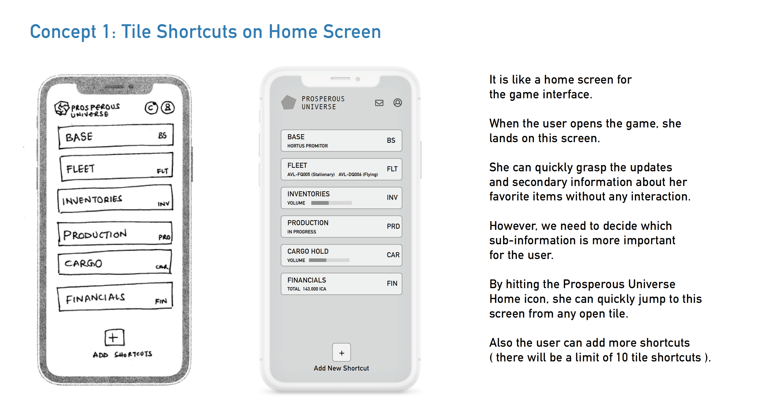
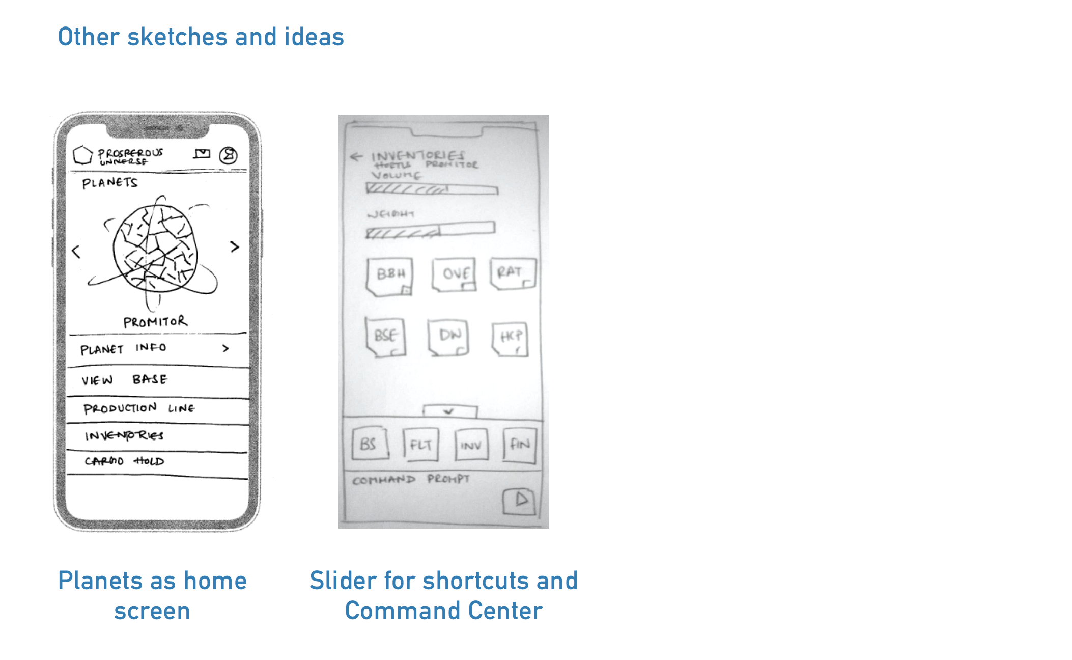
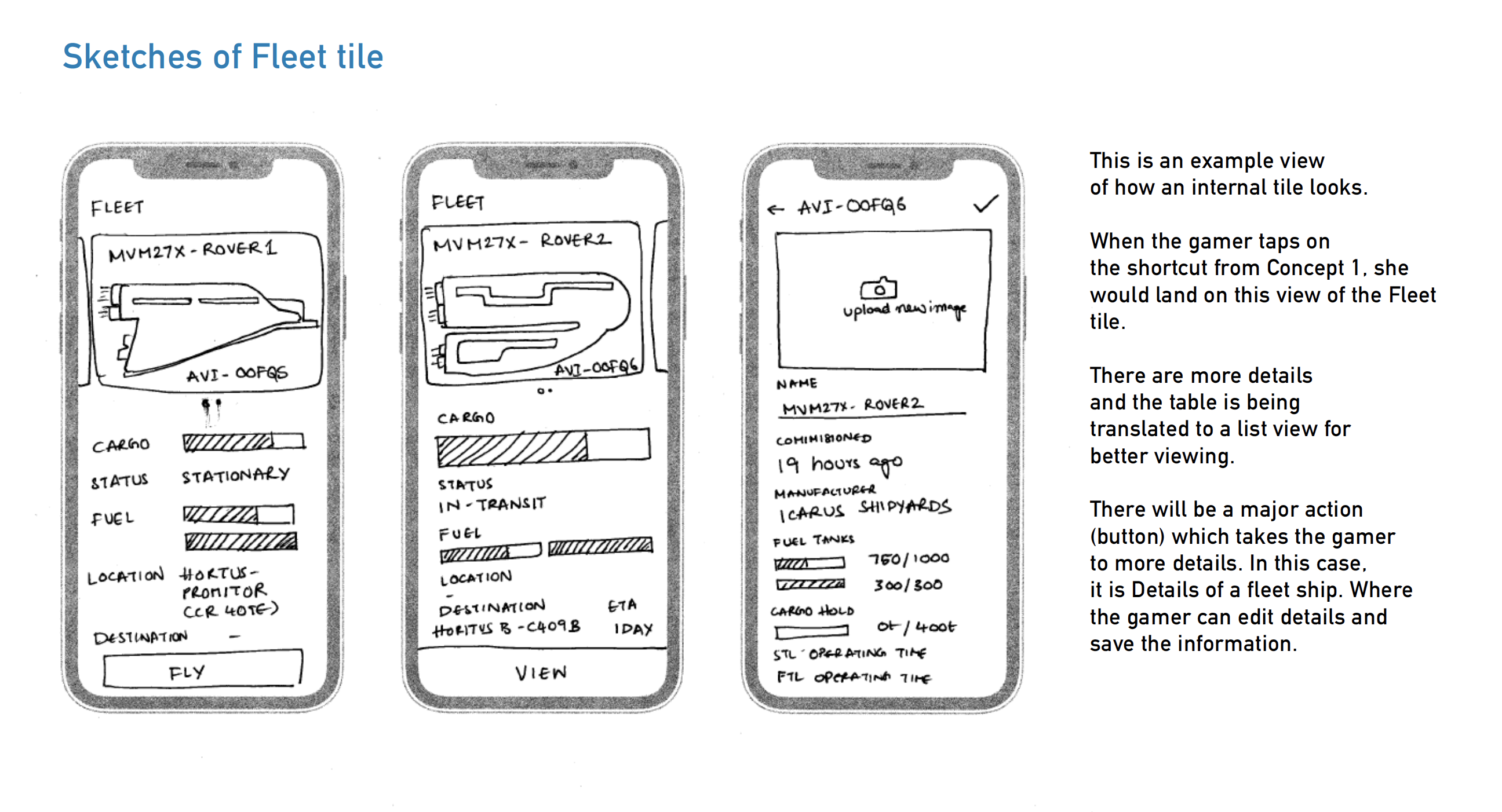
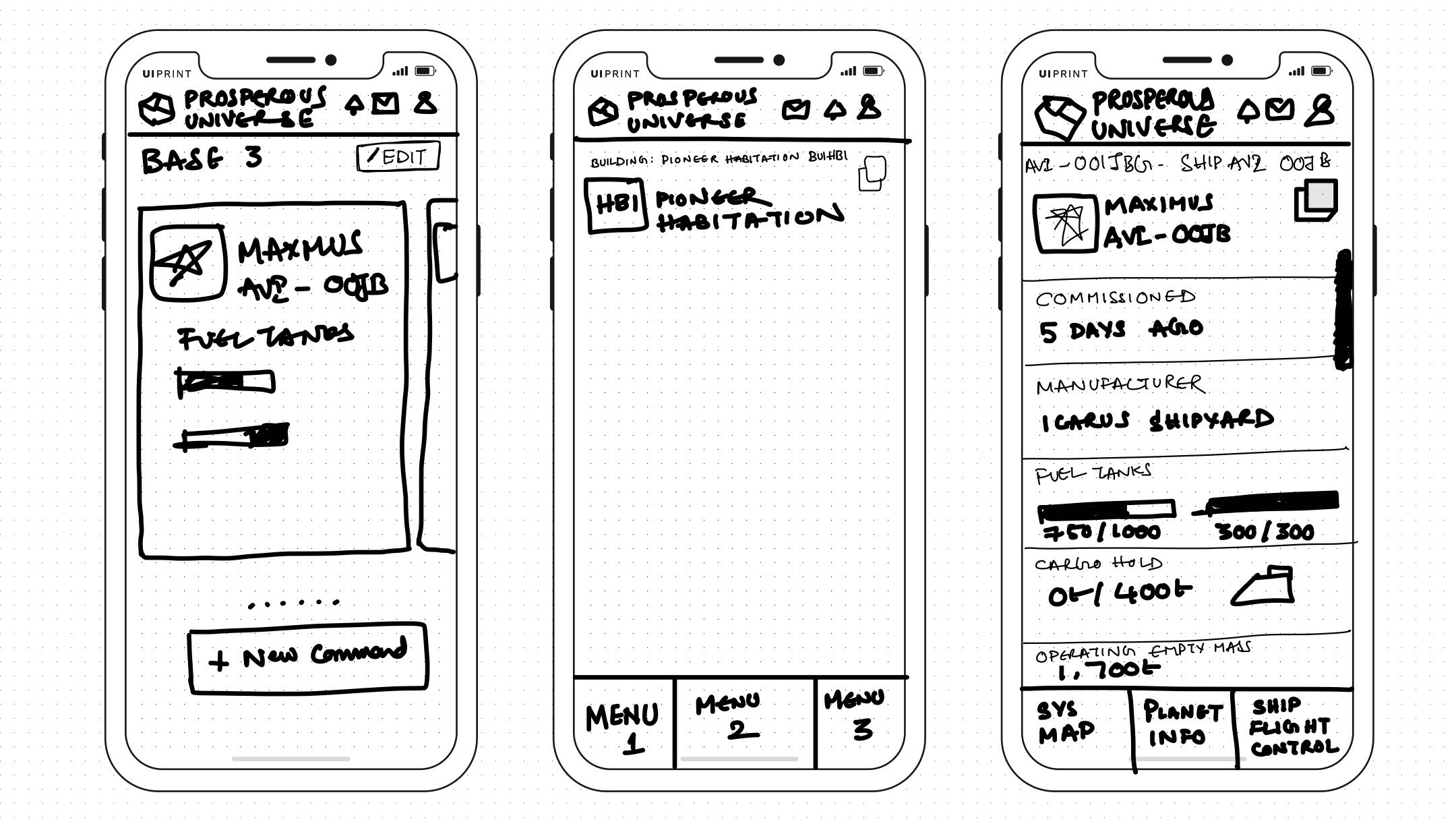
Initial sketches
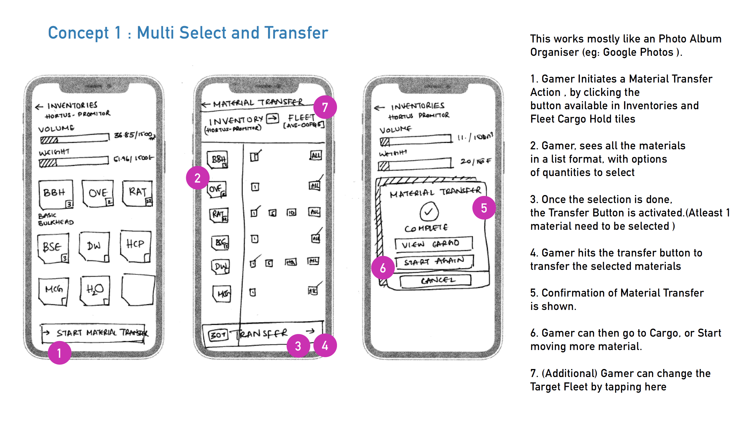
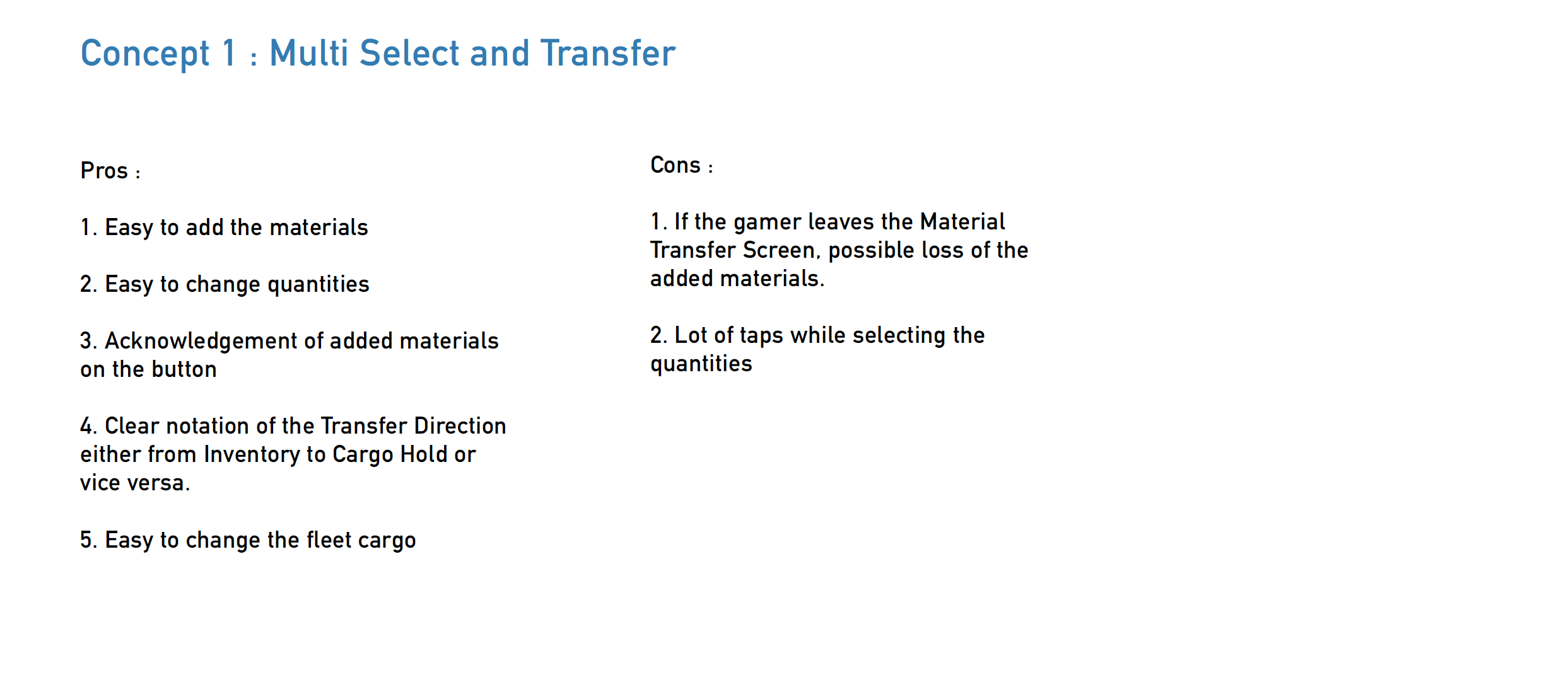
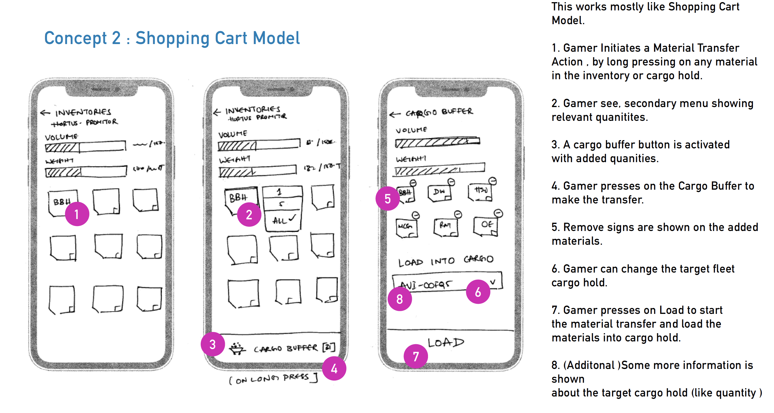

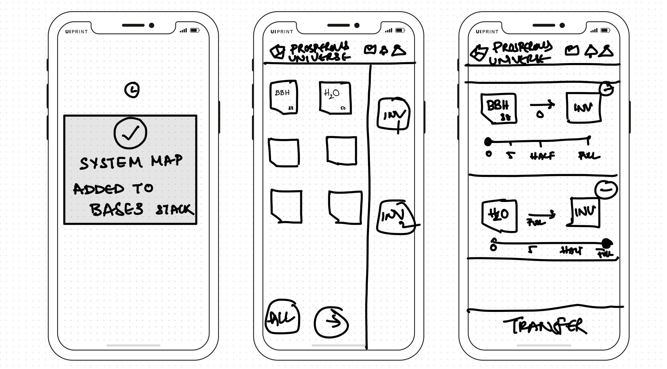
PROCESS
How we got there
After evaluating all my concepts and thorough brainstorming, we as a team arrived at a common solution for the interface and
material transfer interaction as they are the crux for the application.
I later developed them into wireframes and detailed designs.
Some of the key workflows were :
- Basic Functions
- Communication
- Creating Command Cards
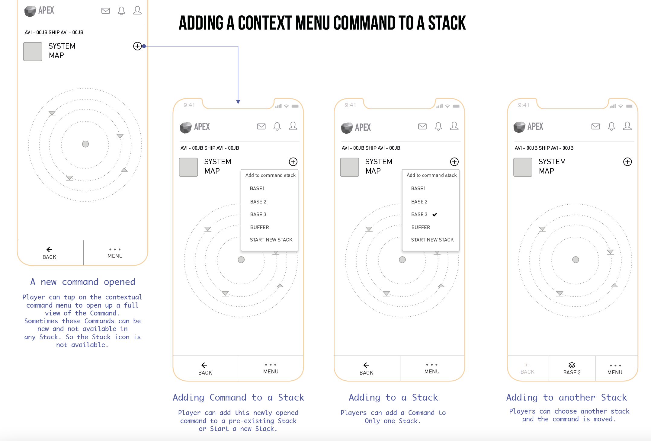
- Contextual Menus
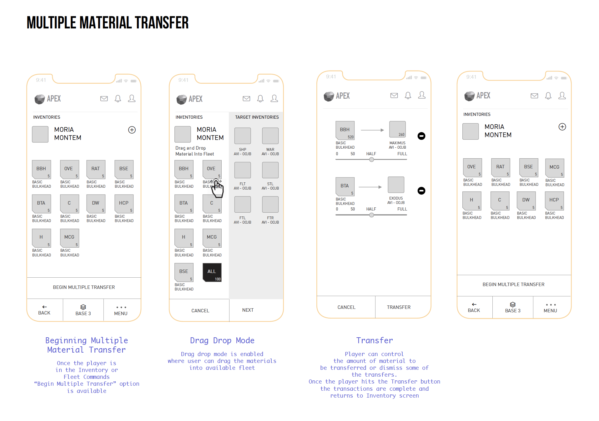
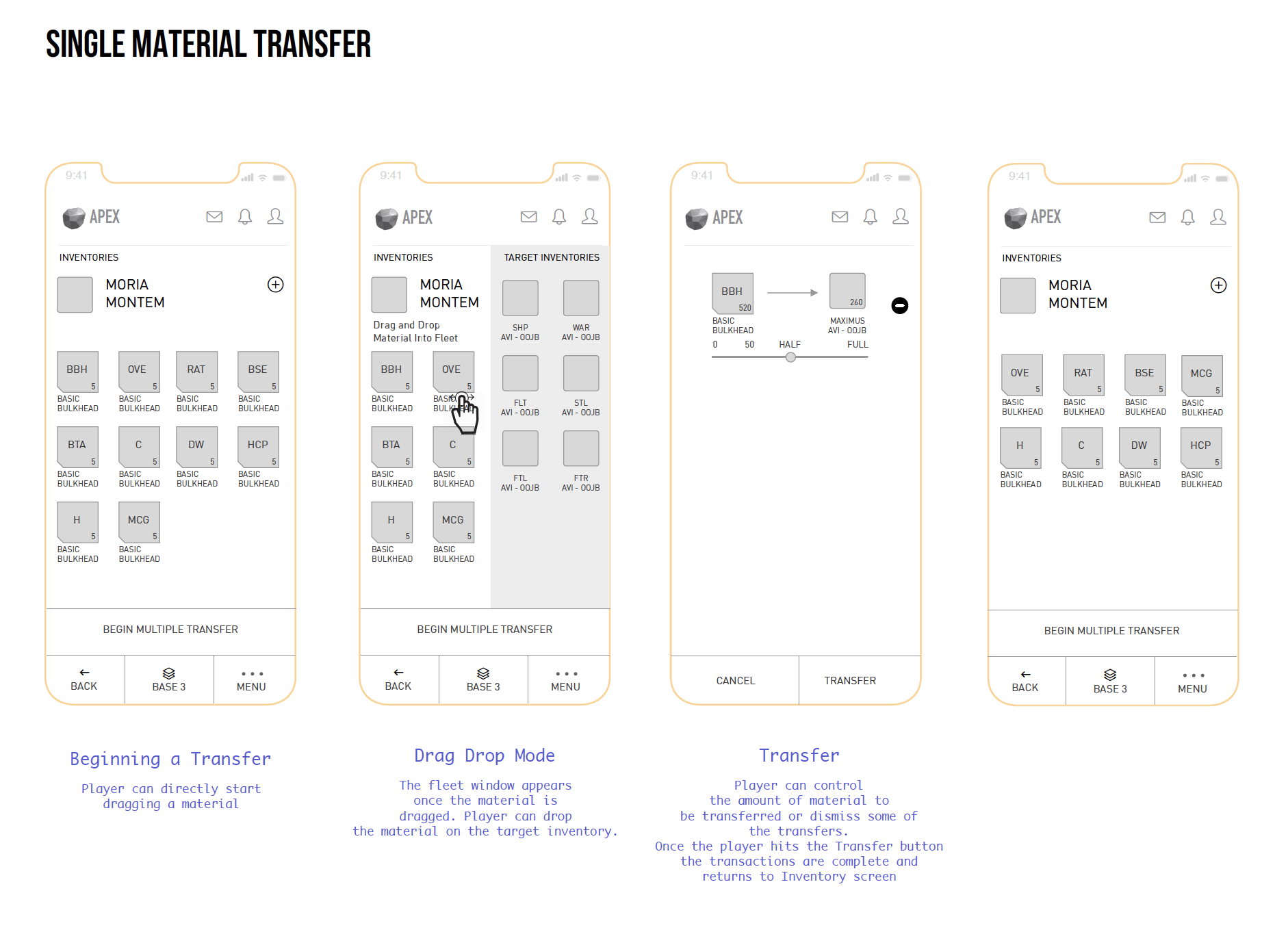
- Single and Multiple Material Transfers
SCENARIOS
Displaying stacks
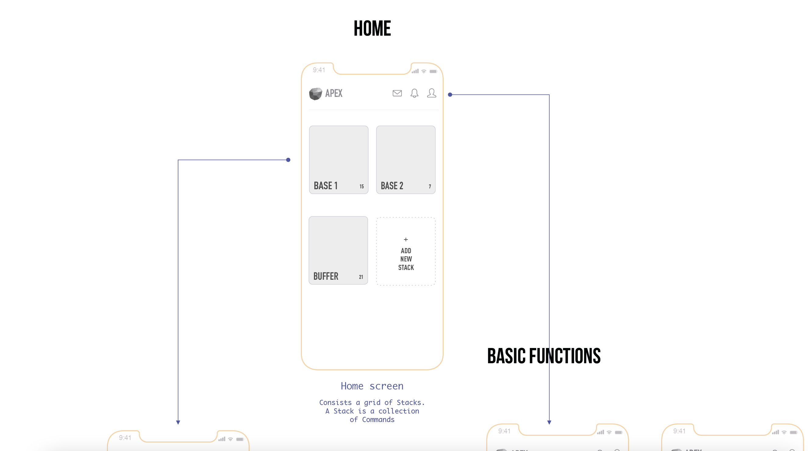
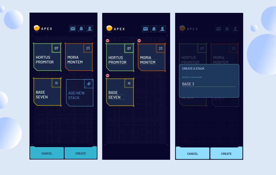
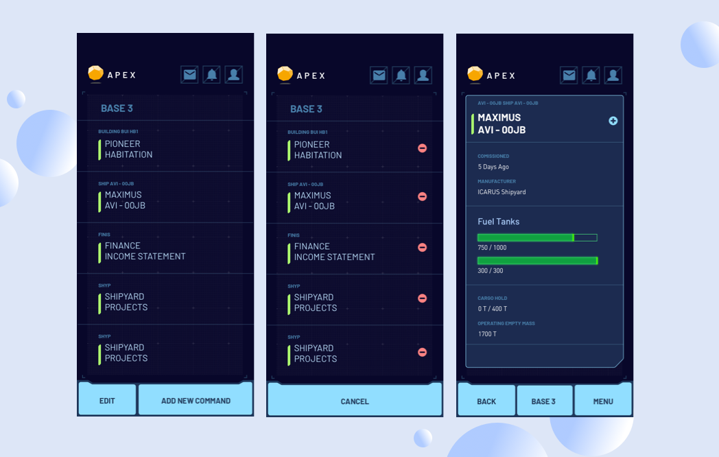
Stacks are essentially collections of command cards(Inventory, Ships, Materials, Buildings etc) for each planetary base player create.
Basic functions
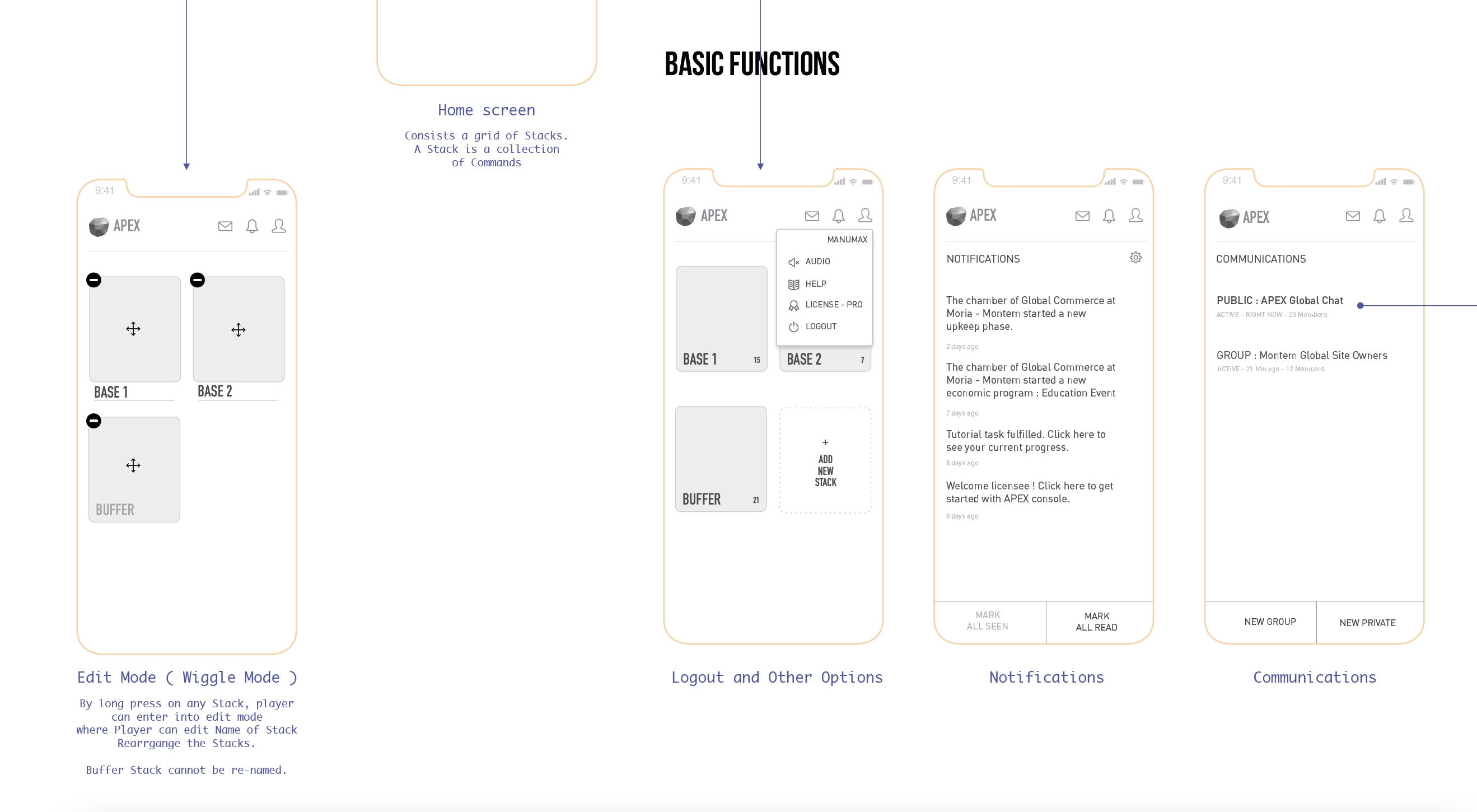
Measuring the pros and cons of each type of representation gave a lot of clarity in our approach.
While displaying the Stack structure on the home, it is essential to Edit, Delete or Create new stacks.
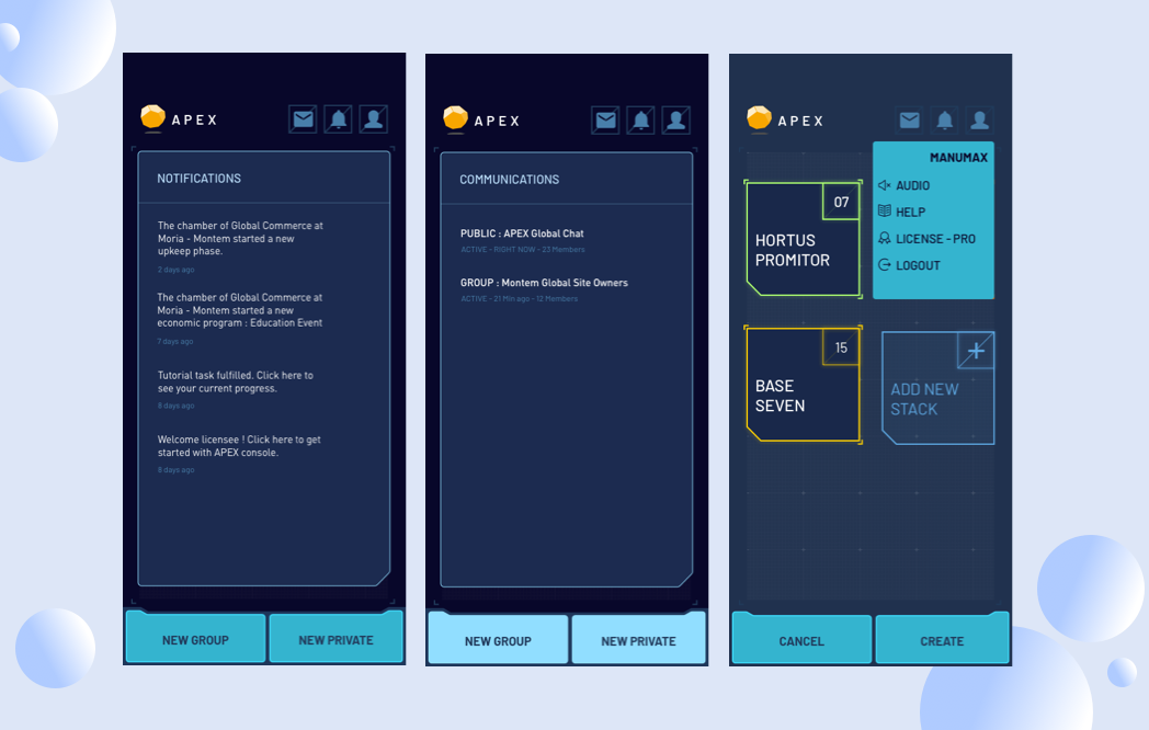
Along with these, the other basic functions include Notifications, Profile, Licenses etc.
Communications and Groups
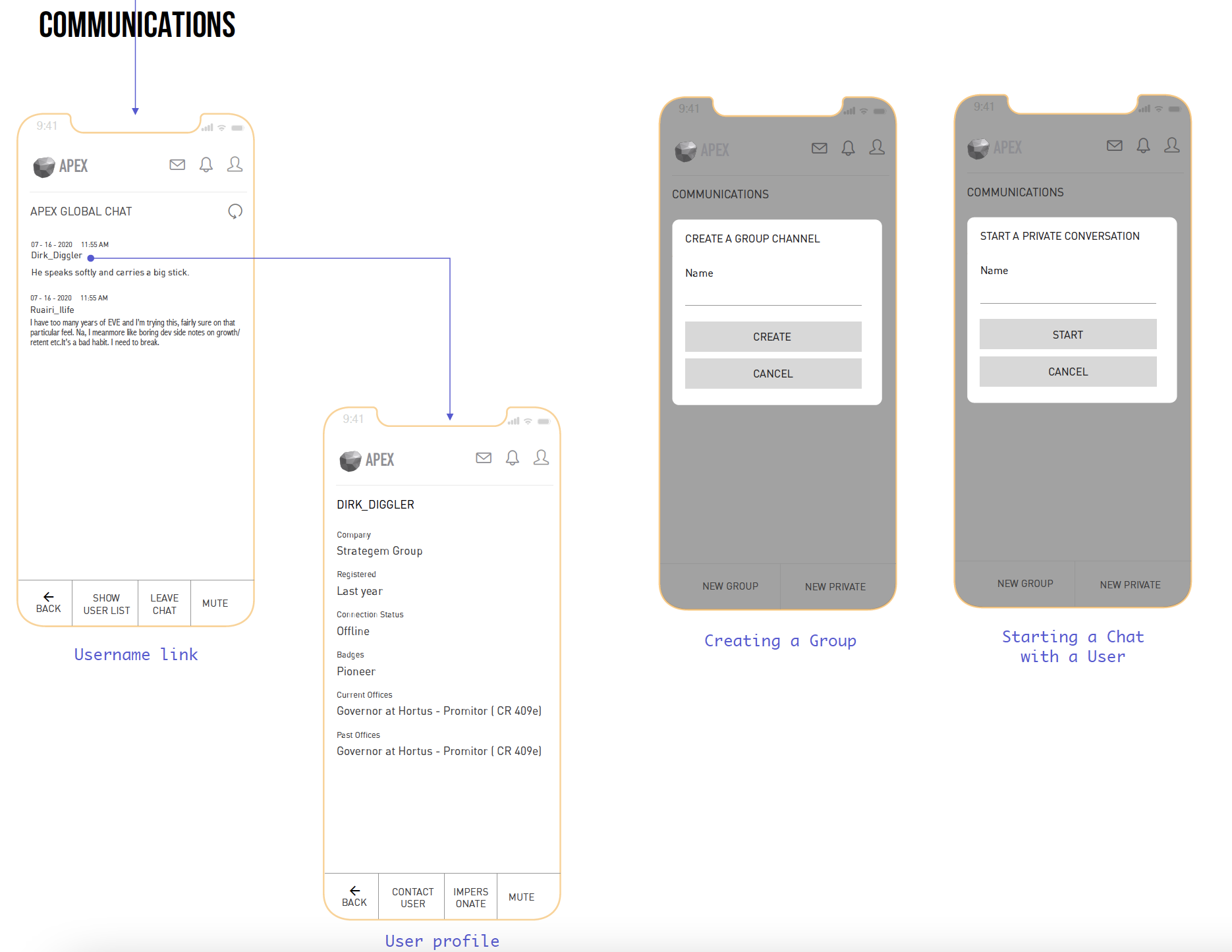
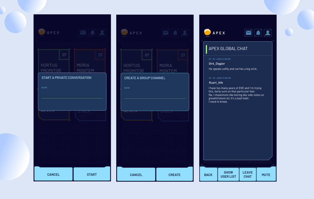
Players will be able to view each others profiles and start a chat or create a chat group to communicate with other players.
Command Cards
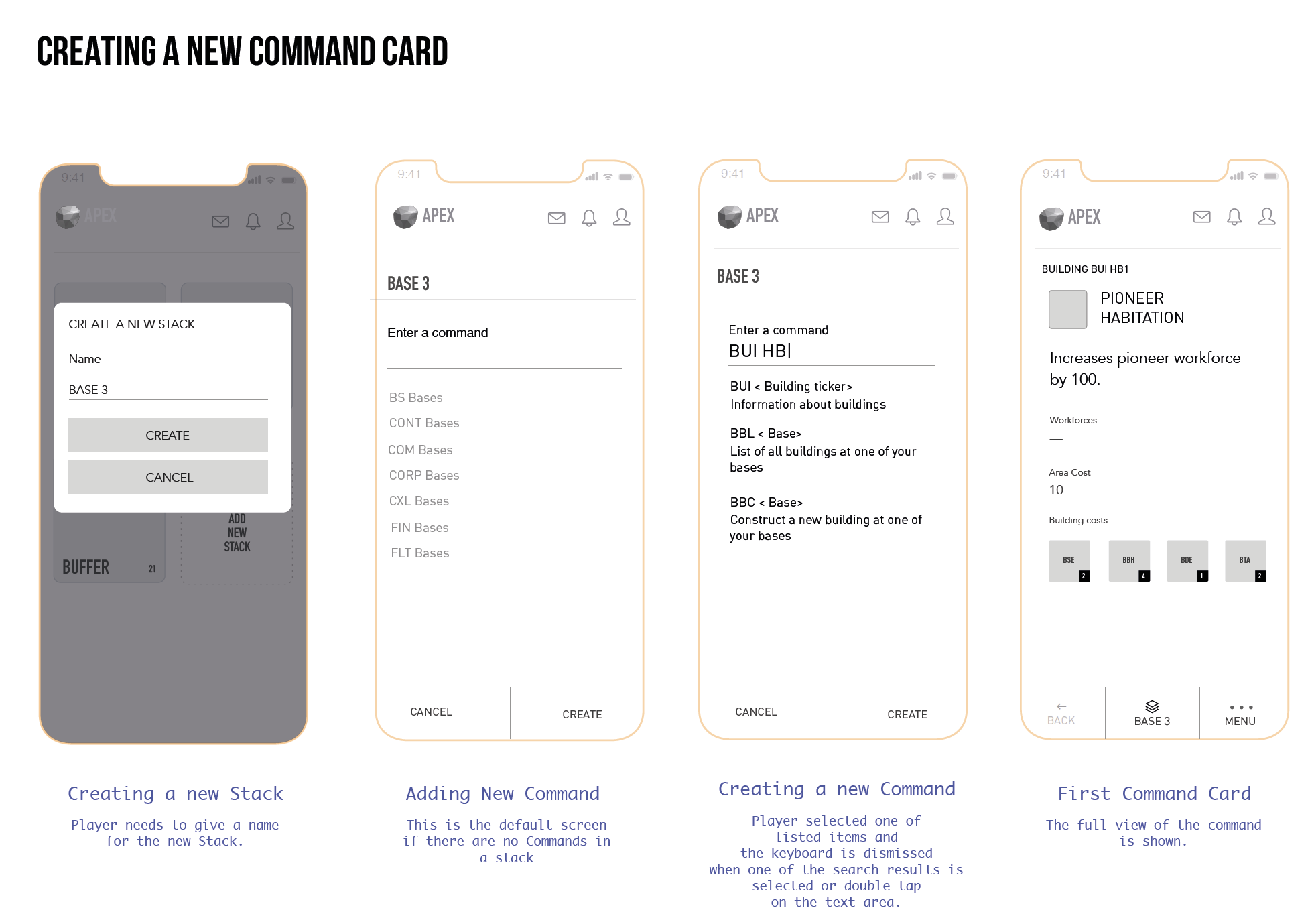
Viewing Command Cards
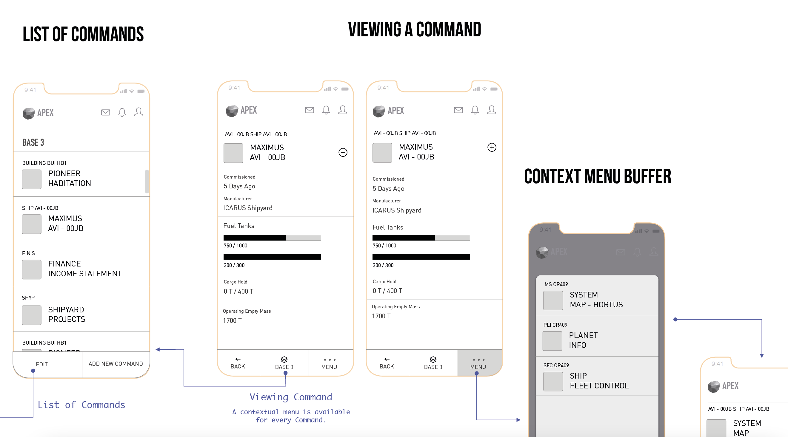
Context Menu
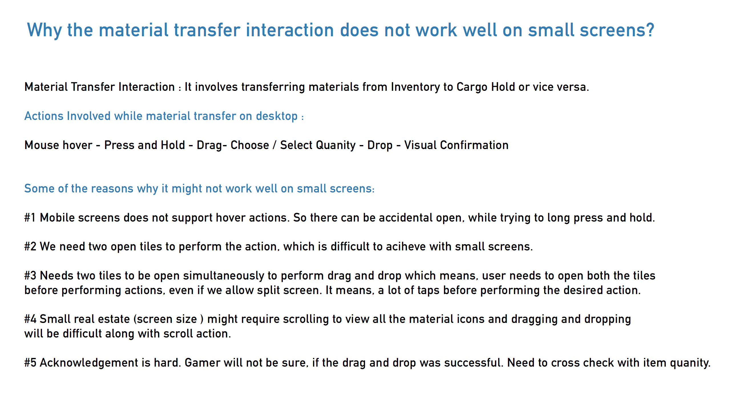
Material Transfer
THE FINISHING
User Interface Design
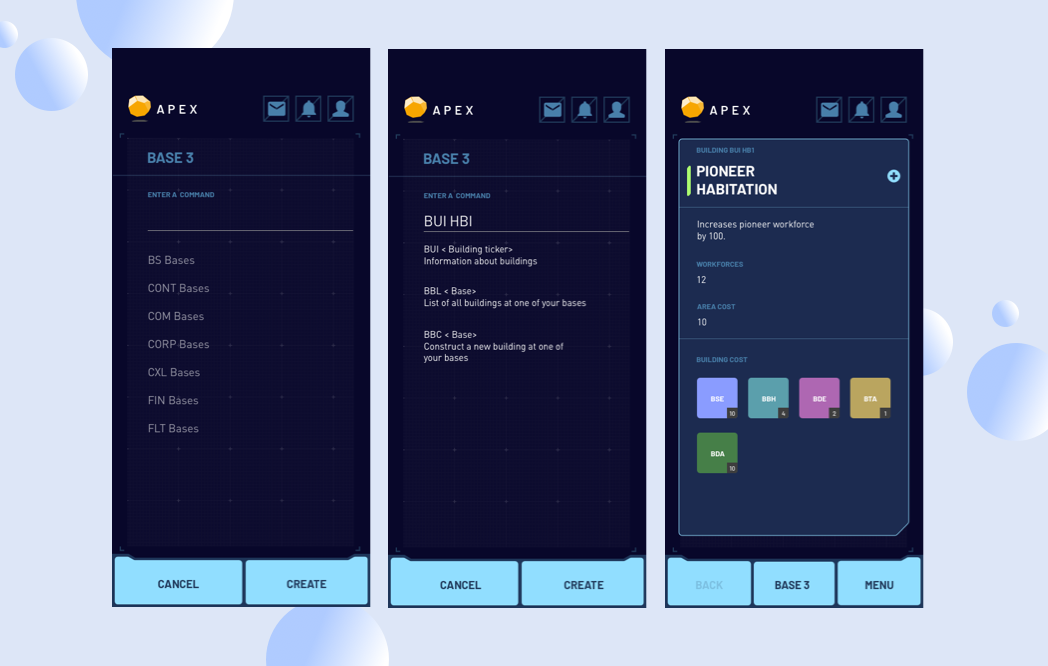
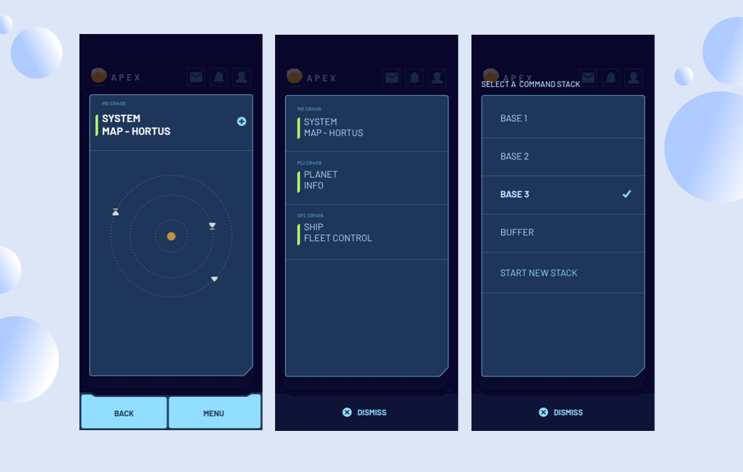
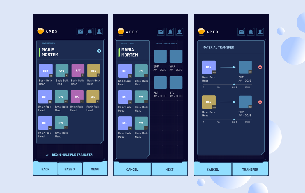
Login Screens with user id and password entry flow
Apart from the above interfaces, I designed the empty states, error states and for other corner cases.
ADDITIONAL
Website and Admin hub

Webiste has been completely designed and developed from scratch following a sci-fi theme and modern UI.
Art work has been provided by internationally acclaimed freelance artist Mark.
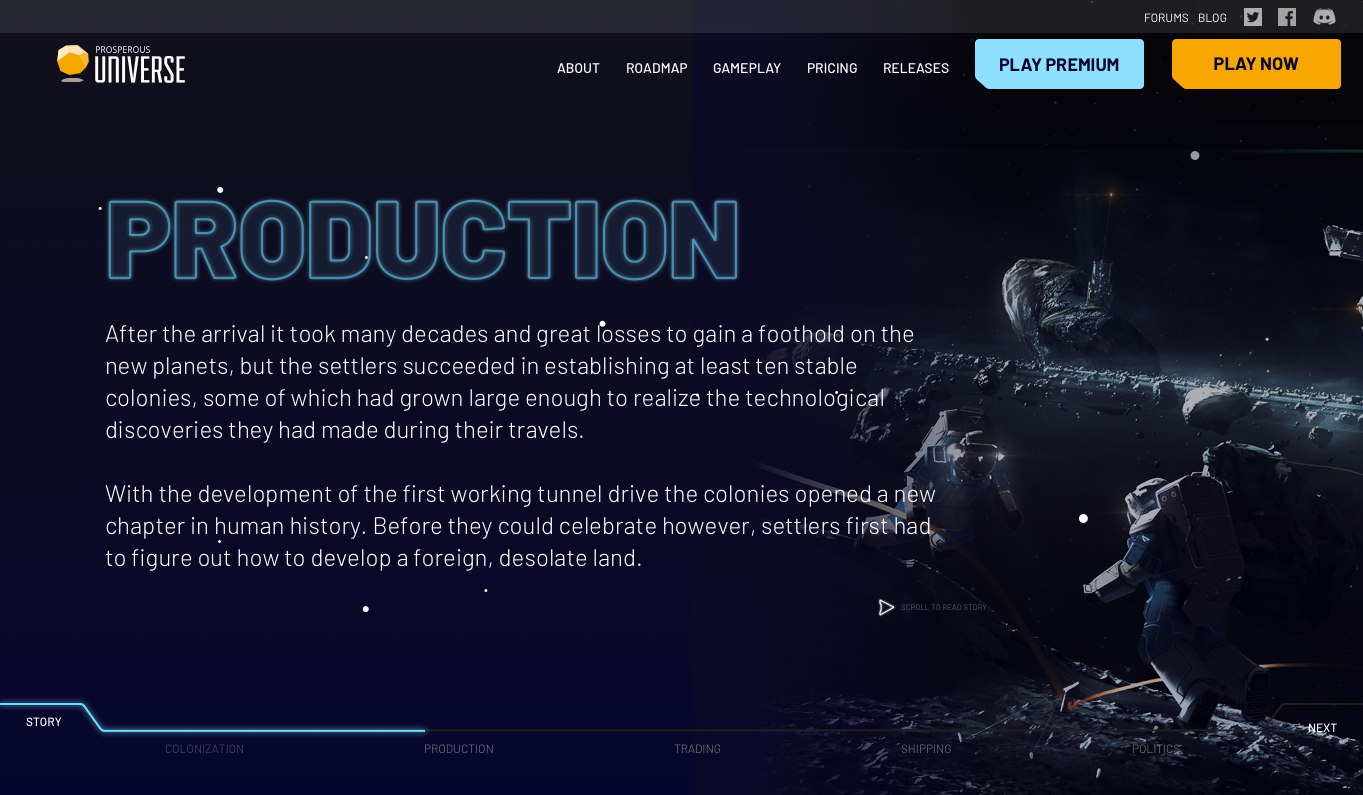
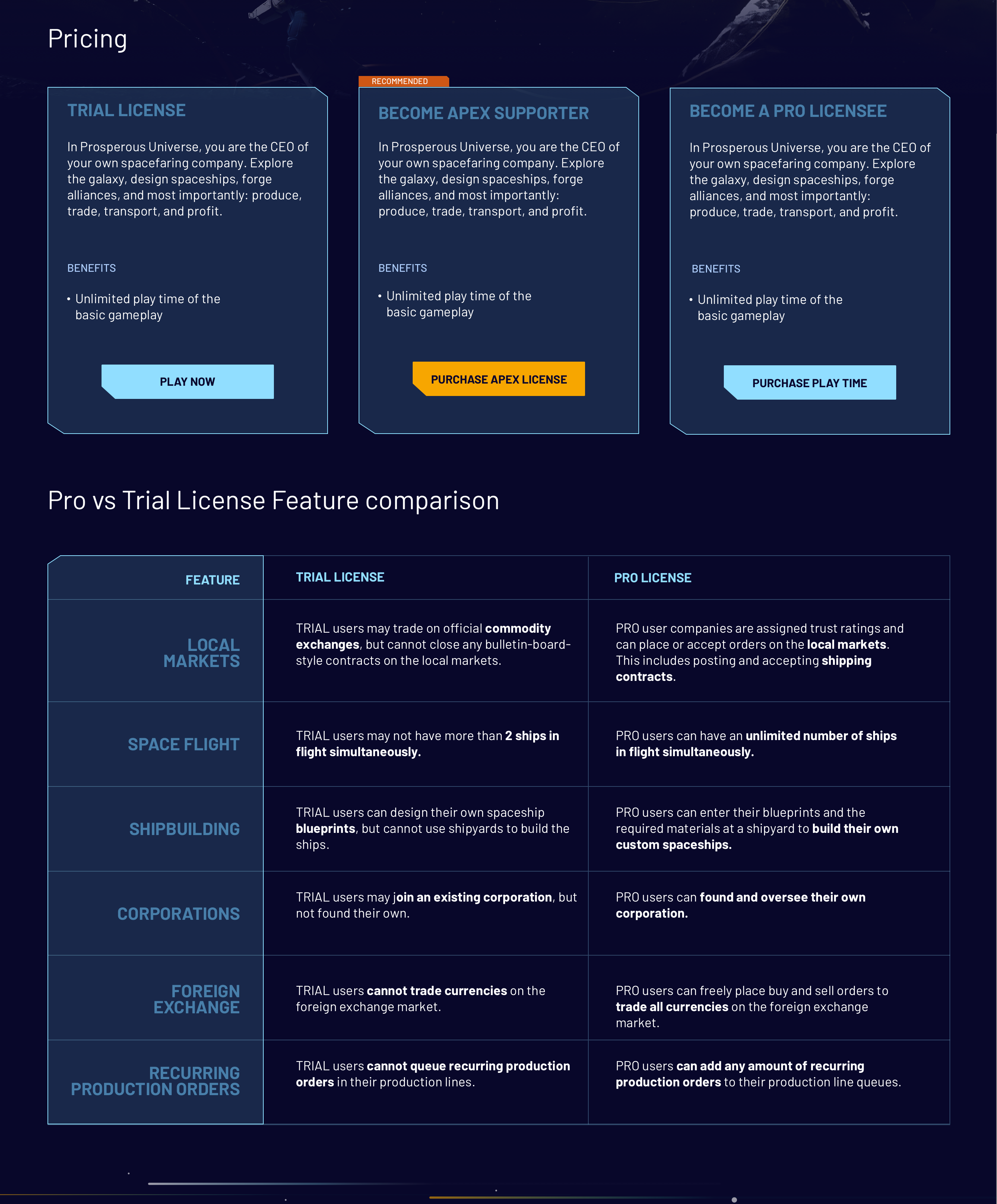
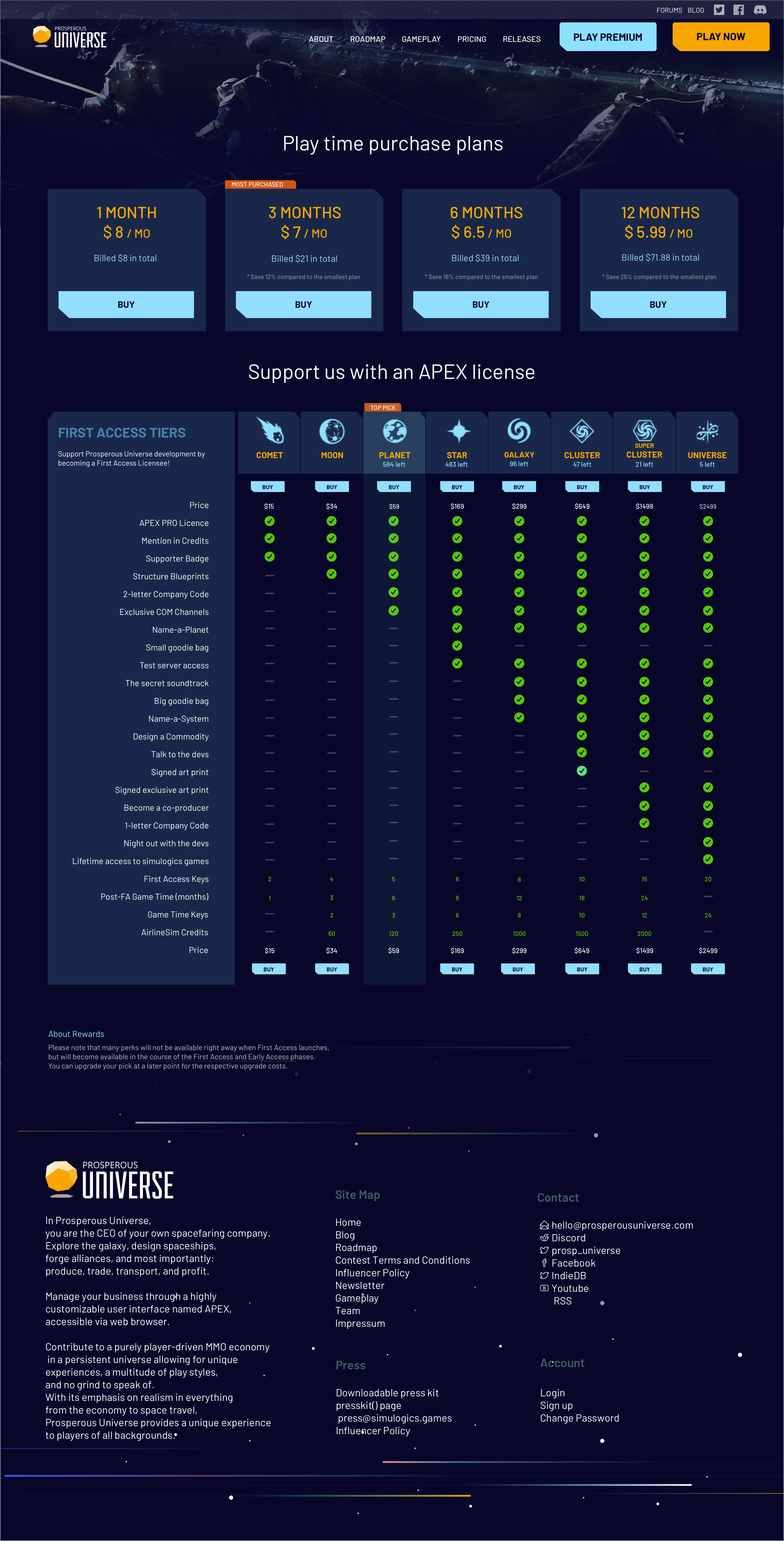
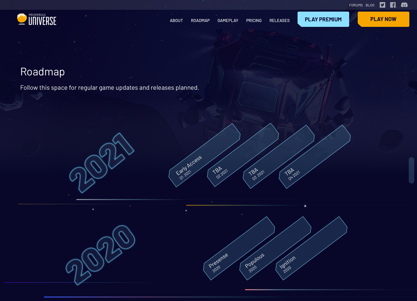
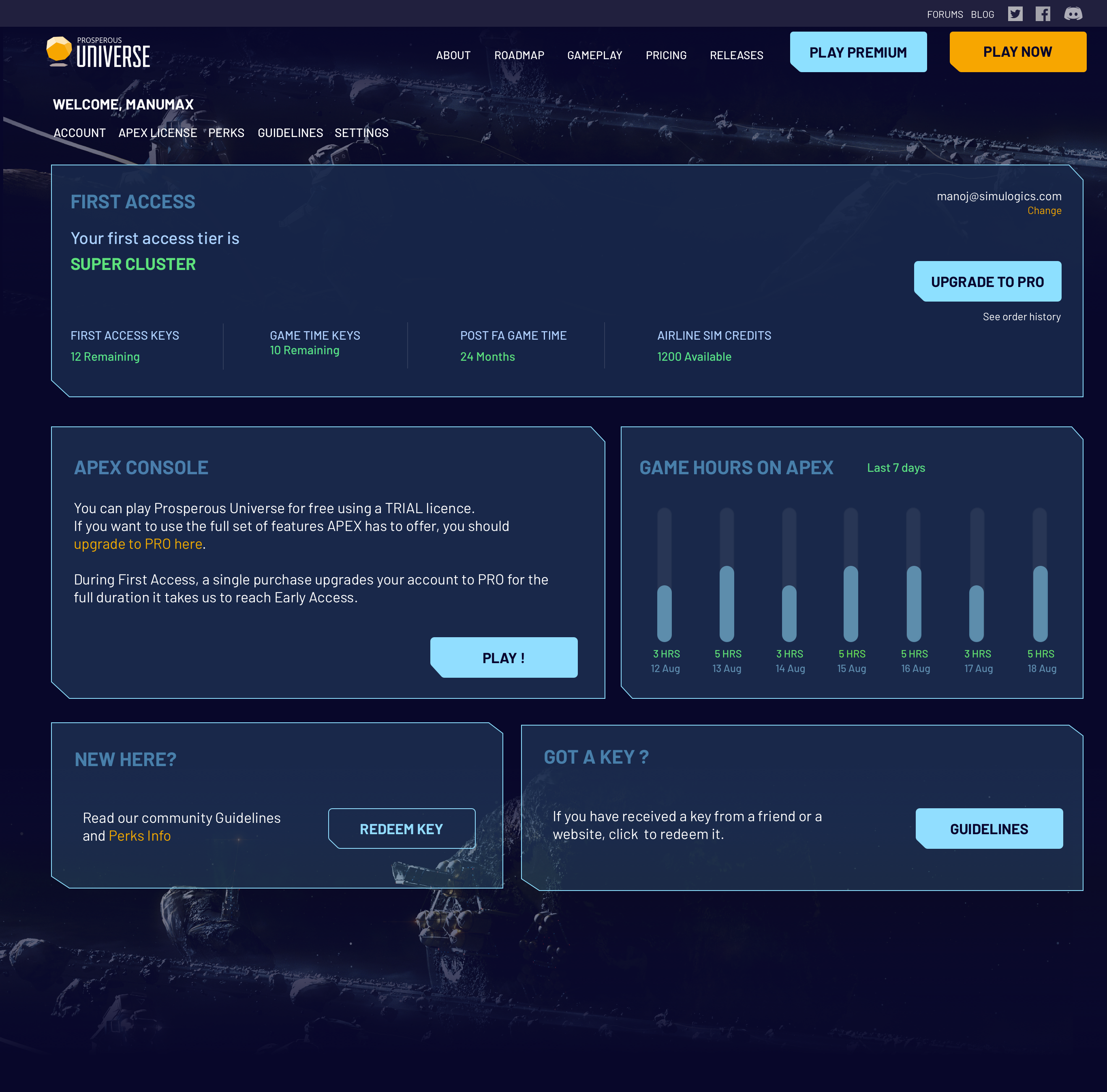
Apart from these pages, I have also designed Login, Signup pages for the hub. On the website there are more
pages to explain gameplay, roadmap, blog etc.
LEARNINGS
Striking the balance
While designing the mobile user interface I came up with a design which was not in match with the Website sci-fi theme. So I had to make more iterations to get the right balance between both.
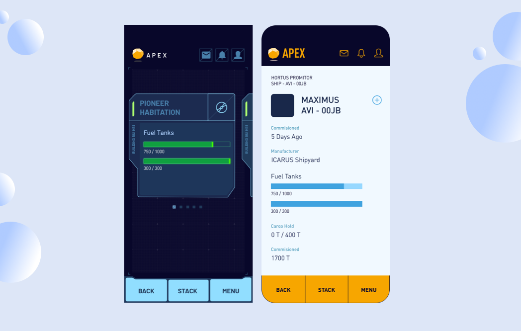
The two iterations of the screens.
IMPACT
The launch
The website was developed in parallel and launched along with the license purchase and account pages.The website was well recieved and we collected the feedback from the
gamer community on Discord channel. We further re-designed About and Team pages and added to the existing site. There has been a steady growth in the game revenue after the launch.
The app is still currently in development