Kinsta Cloud is a platform as a service for teams deploying and managing applications and databases. I designed an operational dashboard to help developers find their services, understand usage, and keep track of activity.
My role
Product Designer 2021–2023
Collaborators
Lorant — Design system Peter — Review and feedback Csaba — Product vision and goals
My broader scope included application and database experiences, analytics, domain management, and customer activation. This case study focuses on the dashboard and the path into a first deployment.
The challenge
A clear starting point for a new cloud platform
Kinsta Cloud brought application and database hosting into a platform that also supported WordPress. Developers needed to understand what was running, find their services, and keep track of resource usage without piecing together information from separate screens.
My focus was an operational analytics dashboard for managing applications and databases. The challenge was to define a useful overview while the product, its service model, and its requirements were still taking shape.
Customer problem & insights
Understanding how developers monitor their work
I studied cloud platform documentation, worked through the CTO’s technical documentation, and explored deployment states and the relationships between applications, processes, and databases. This helped me translate technical concepts into a dashboard developers could use.
Customer interviews highlighted a need for CPU and memory usage on the home dashboard, access to historical data, and better visibility into costs. Developers also wanted usage caps and notifications before crossing limits.
Monitor performance: make resource usage and important operational metrics easy to find.
Understand changes: provide context beyond the current month and show recent activity.
Control costs: make usage and billing visible, with clearer signals around limits.
Competitor exploration and ongoing interviews also surfaced demand for low-cost testing environments and detailed logs, without requiring a separate analytics service.
Product direction
Organizing the dashboard around developer needs
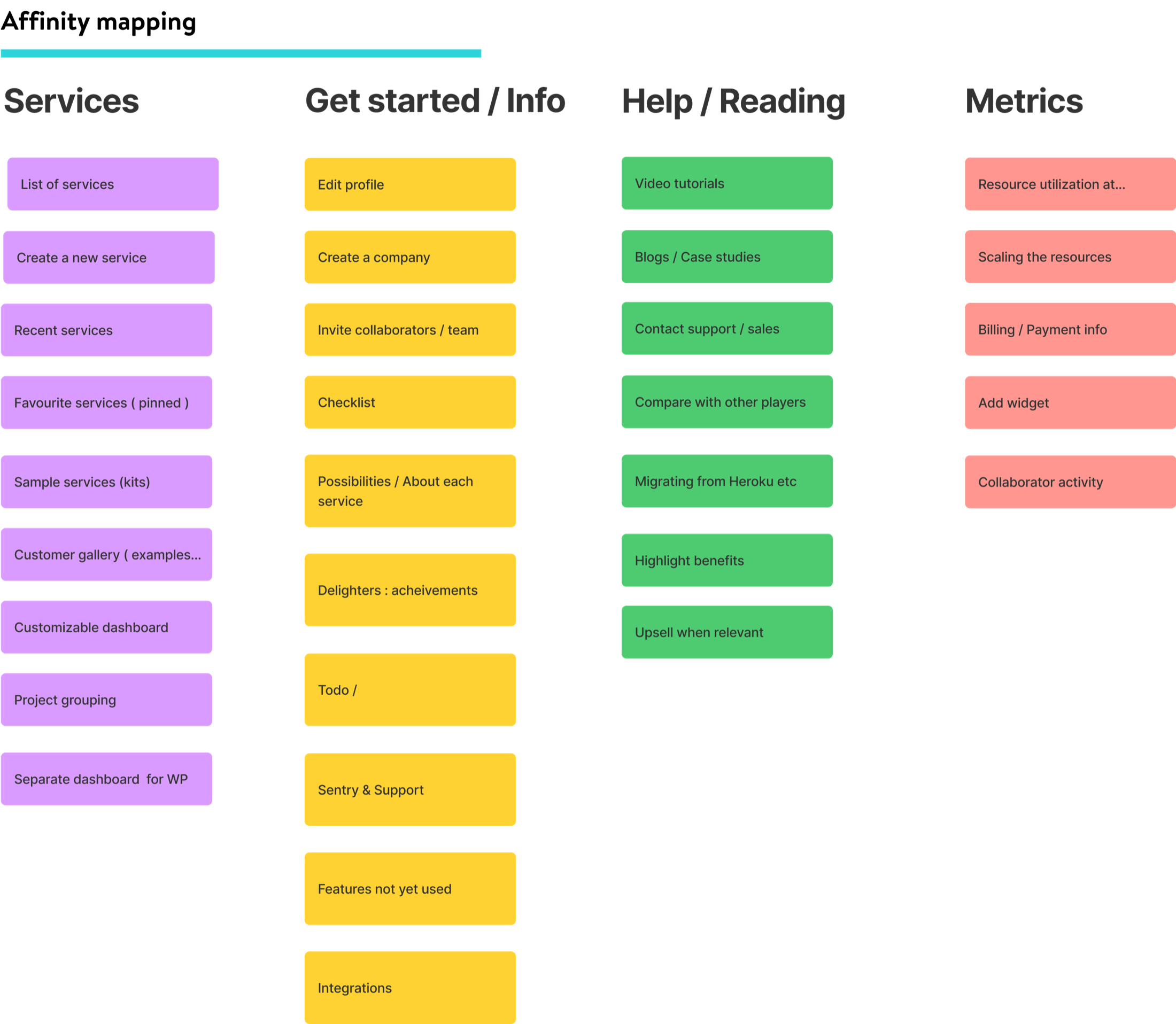
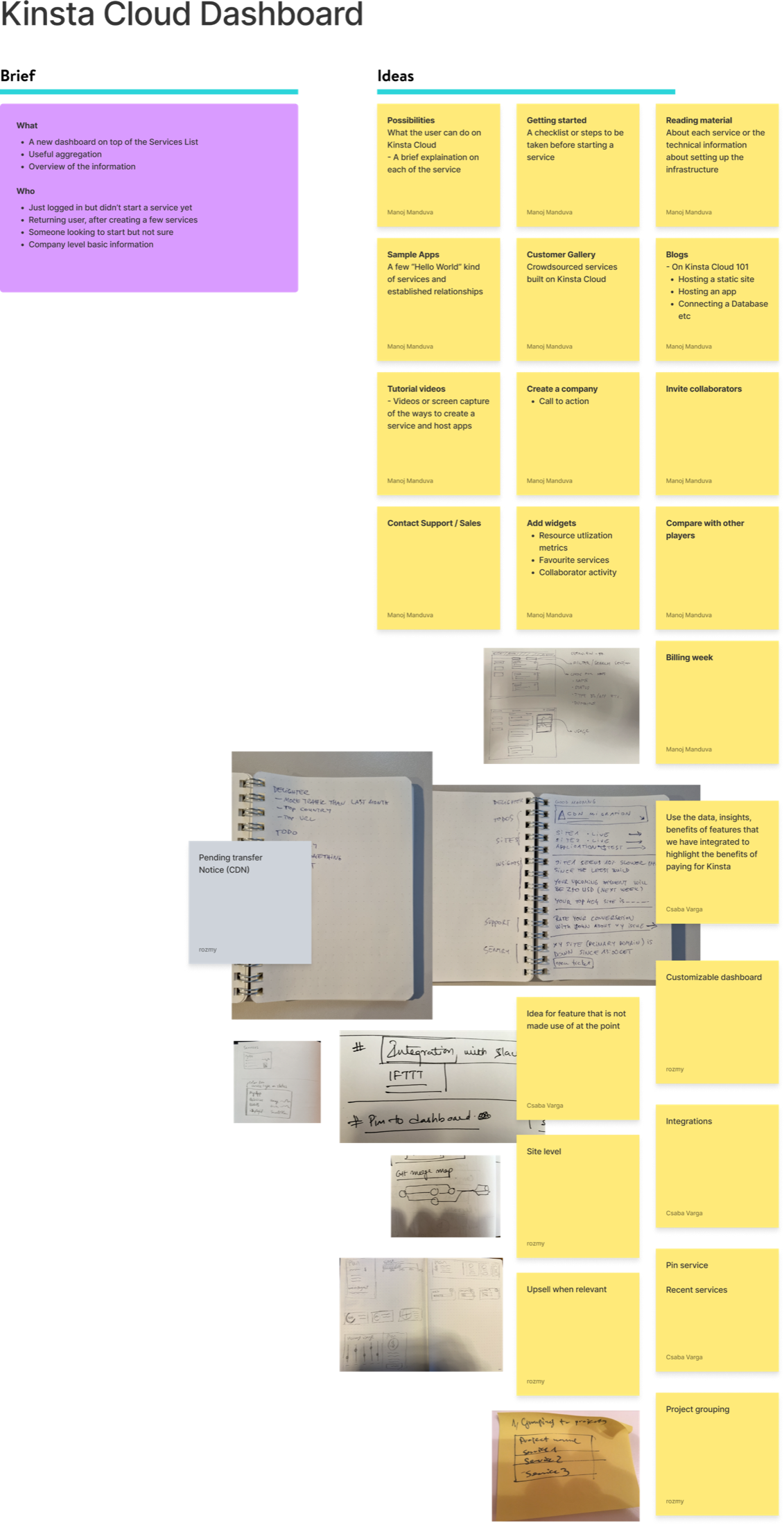
In discovery workshops, we collected ideas and grouped them into services, getting started, help and resources, and metrics. That structure connected a first-time user’s setup needs with the operational information a returning user would look for.
Grouping workshop ideas into four areas of the dashboard.
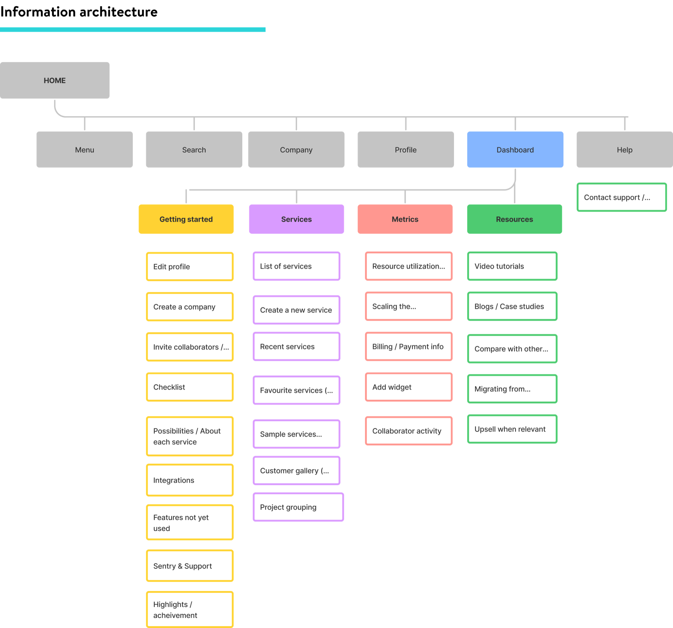
The information architecture placed these groups within the wider product navigation. Alpha and beta milestones gave the team a way to discuss delivery scope as the product developed.
The dashboard structure and its relationship to the surrounding navigation.View the full discovery workshopThe complete workshop board, including material outside the presentation’s visible slide frame.
Design exploration
Working through the service and resource model
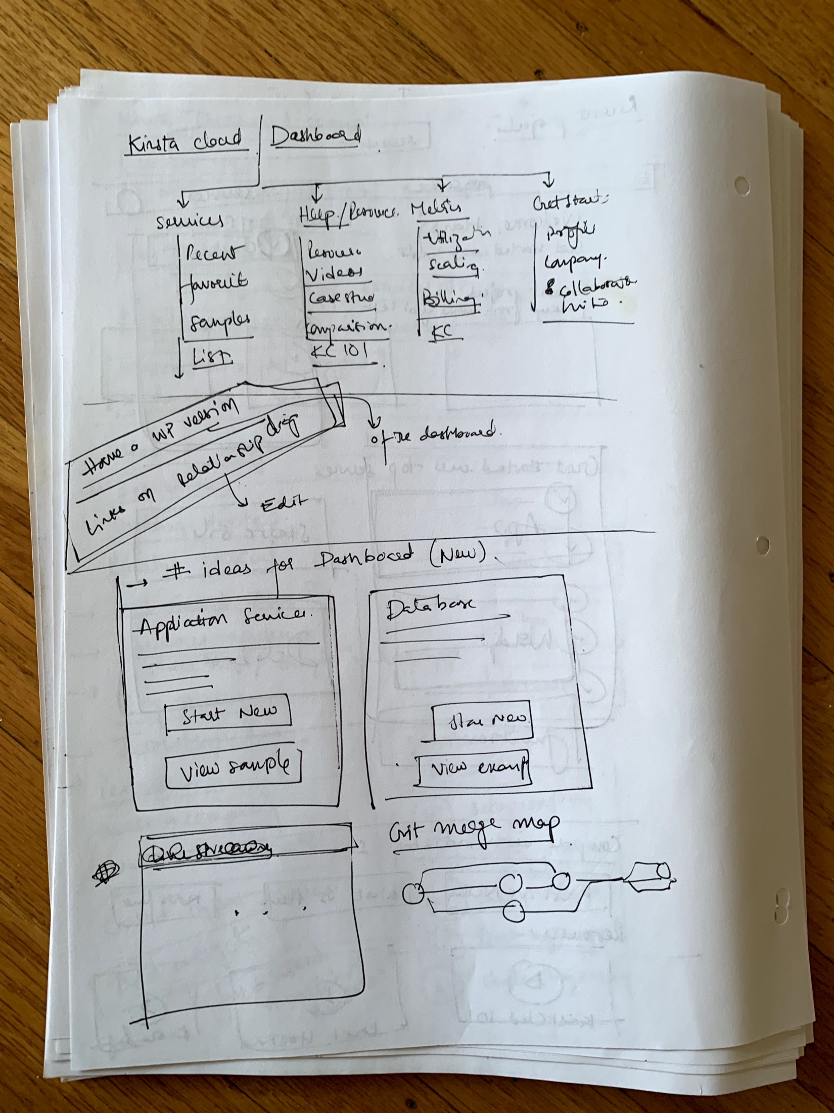
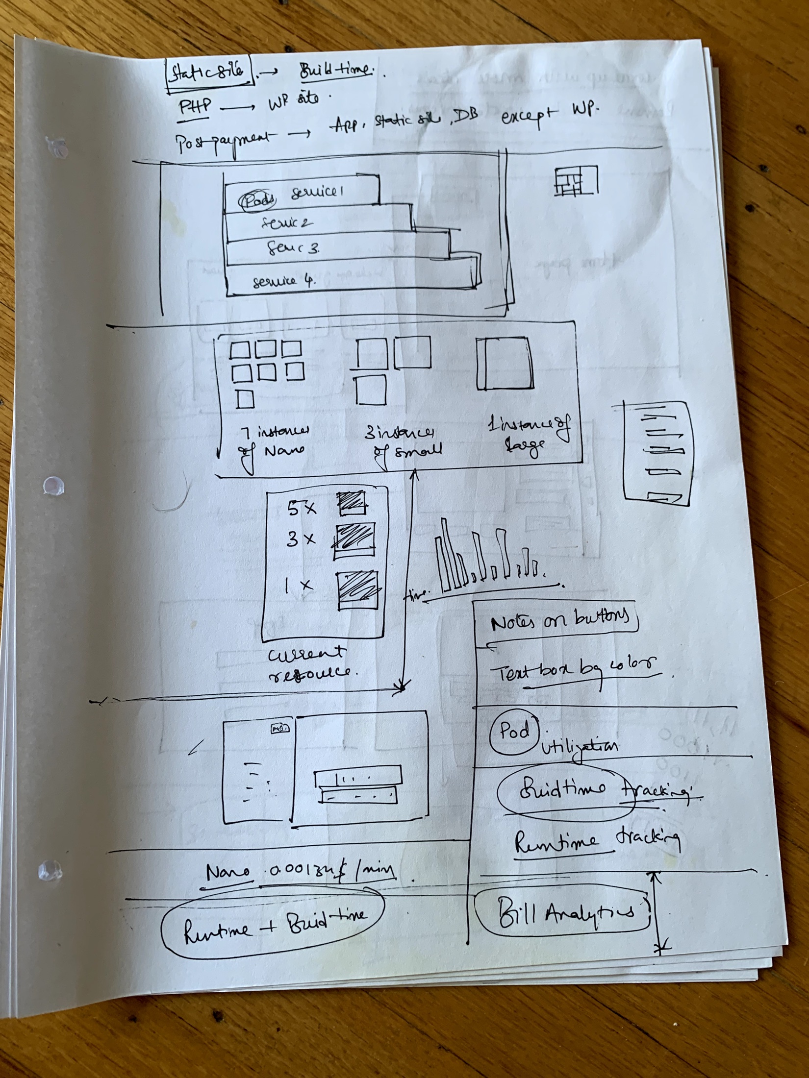
I explored the dashboard through sketches before moving into detailed screens. The sketches tested how services, resource metrics, and getting-started guidance could sit together, including different ways to represent instances and their usage.
Exploring the dashboard hierarchy and entry points.Exploring how resource allocation relates to usage and billing.
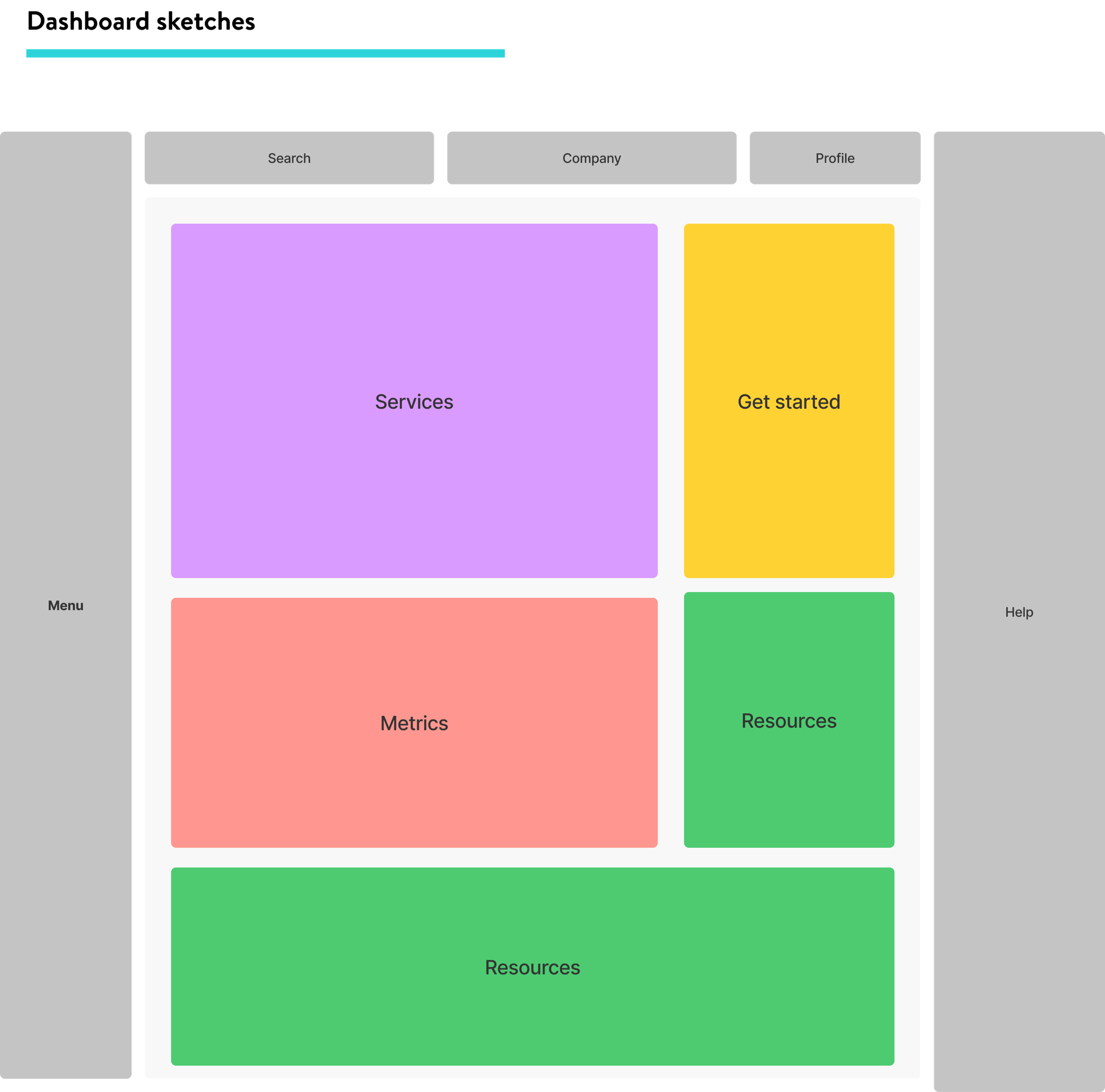
A layout study translated the information architecture into an initial page structure.
Design iterations
From service discovery to an operational overview
The dashboard evolved through several directions, exploring how much information to show at a glance and how to balance setup guidance with everyday monitoring. These screens trace the progression from visual service tiles to structured service lists and a broader alpha dashboard.
The walkthrough describes visible changes across the design versions. Screens contain sample data; version labels do not establish that every concept shipped.
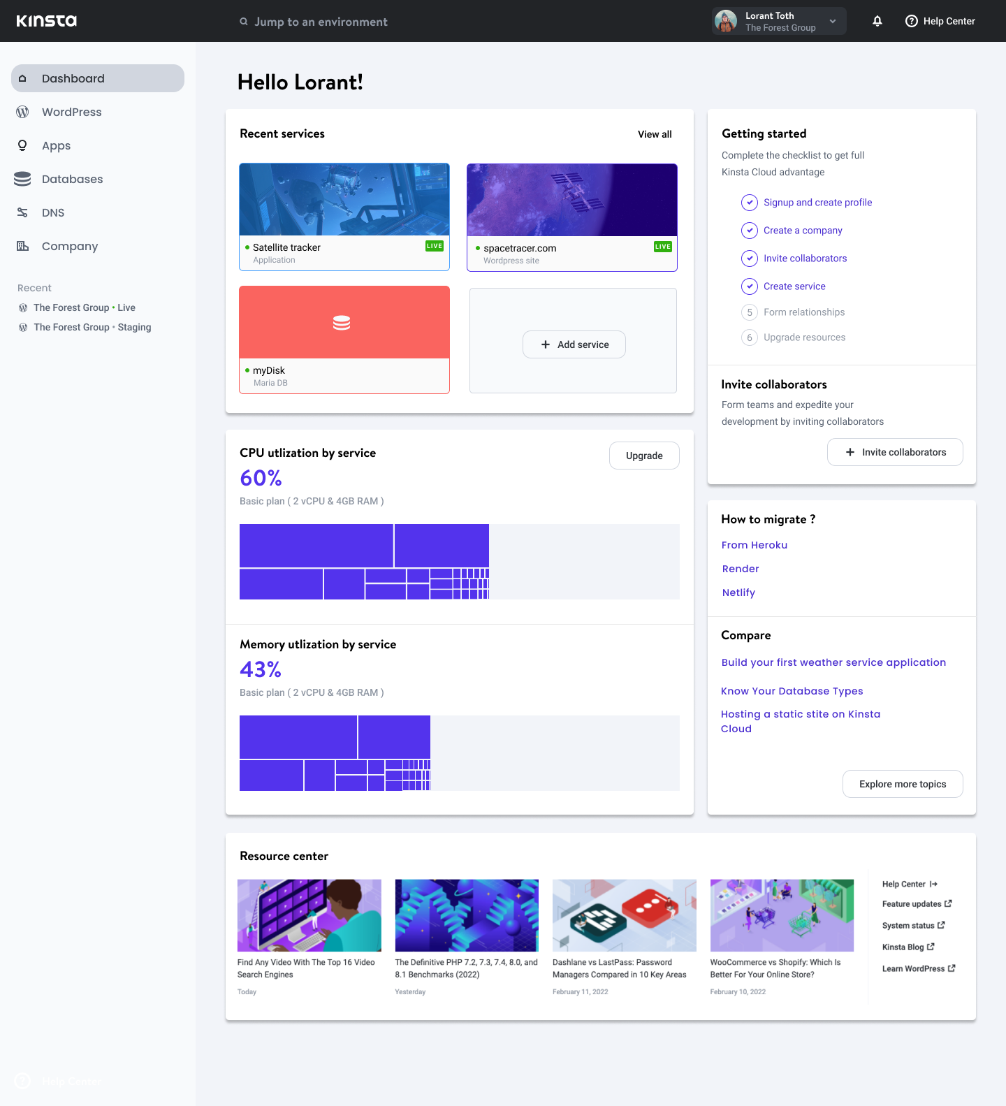
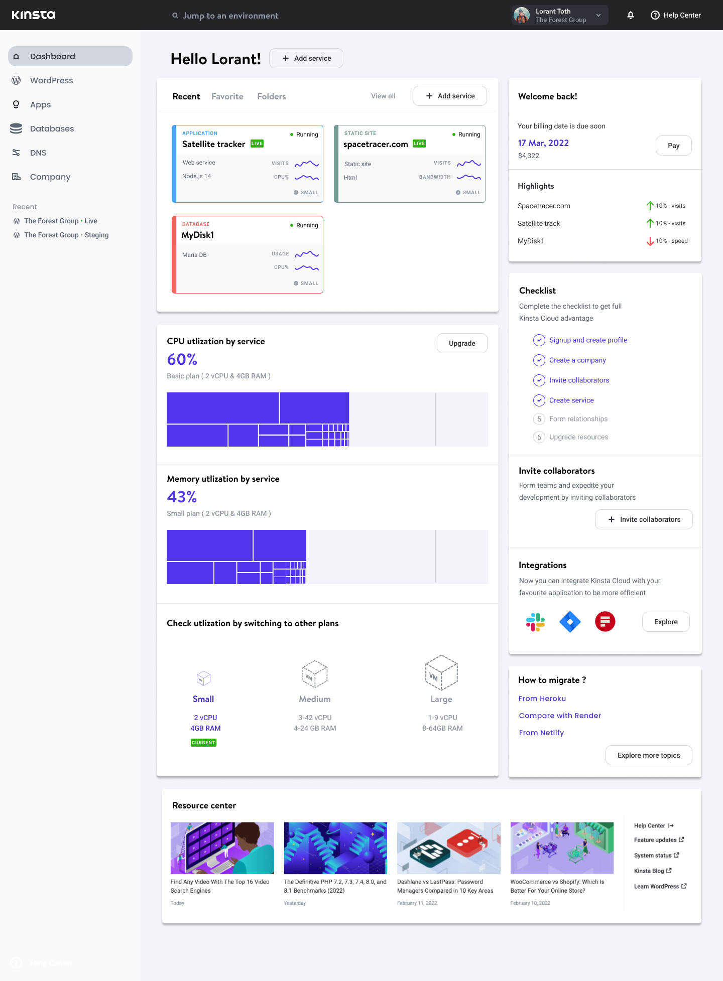
The first direction combines recognizable service tiles with getting-started guidance. Large thumbnails give recent services a strong visual presence, while a checklist, collaborator invitations, and learning resources help users move forward. CPU and memory treemaps introduce an account-level view of resource consumption.
This layout gives onboarding and monitoring similar prominence. It establishes the main ingredients, but the large tiles leave less room for comparing service details.
The next version turns the service tiles into richer operational cards. Service type, runtime, status, and miniature charts sit closer to each service. Recent, Favorite, and Folders controls explore different ways of returning to work.
Billing reminders and highlights also enter the page. The exploration makes more information immediately available, while exposing a hierarchy challenge: service health, setup guidance, and account messages all compete for attention.
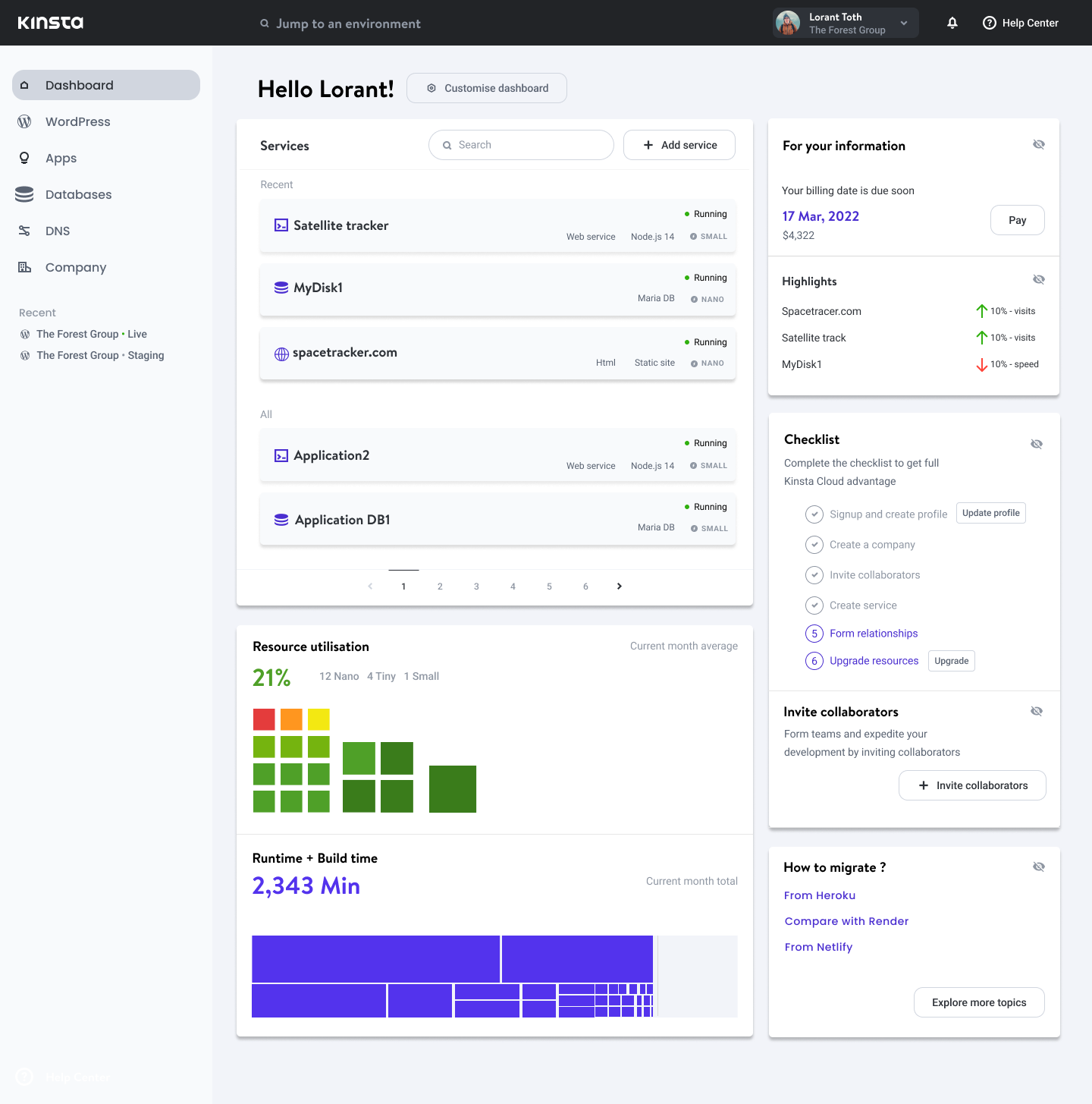
V3 replaces the thumbnail-led layout with compact service rows. Names, service types, technologies, resource sizes, and statuses align in a common structure, with search and an add-service action above the list. Recent and All groupings distinguish quick access from the wider inventory.
The repeated columns make comparison easier to scan. Below the list, resource tiles and a runtime/build-time visualization continue the exploration of how an account overview connects to individual services.
V4 · Giving services and activity a clearer hierarchy
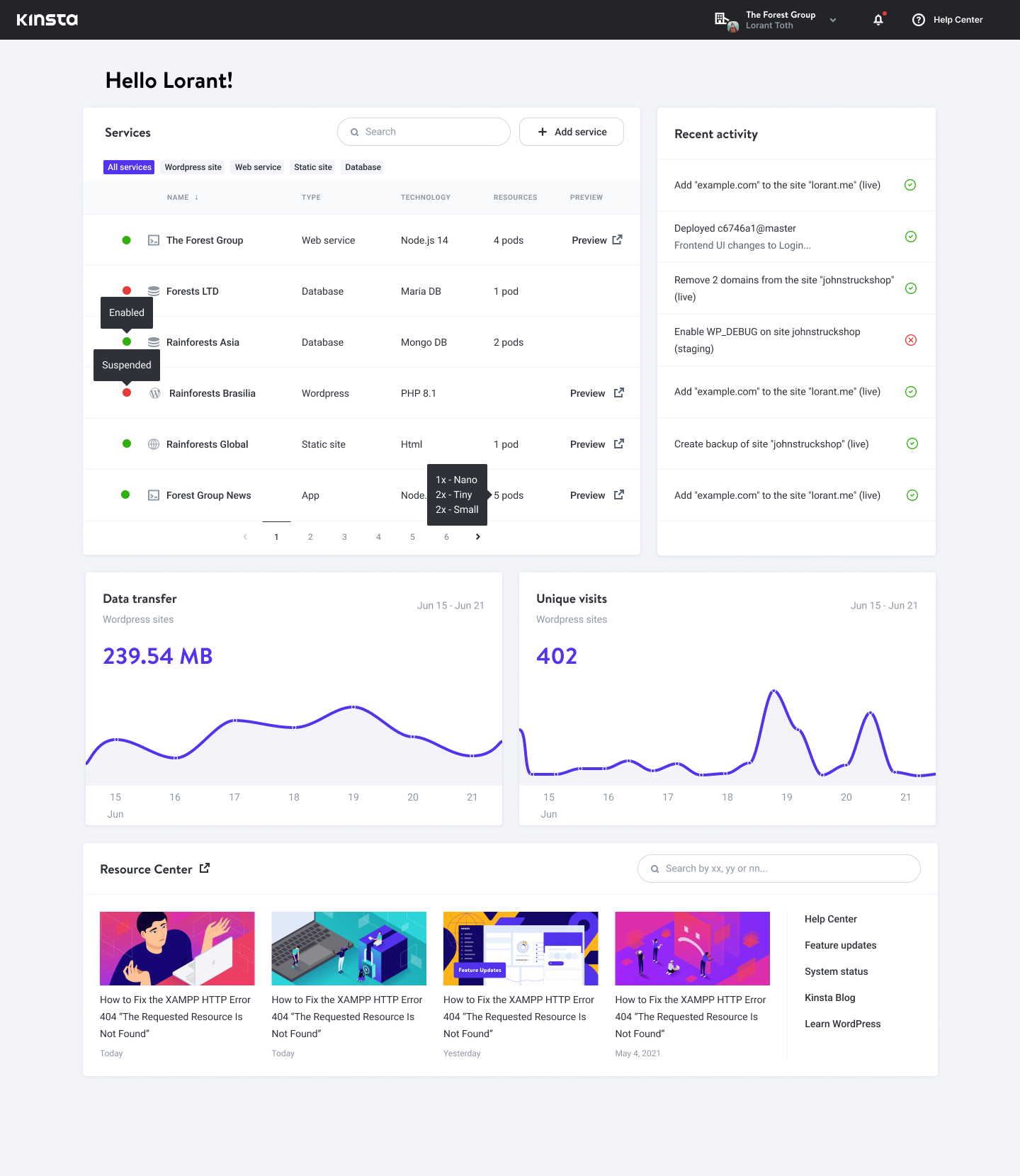
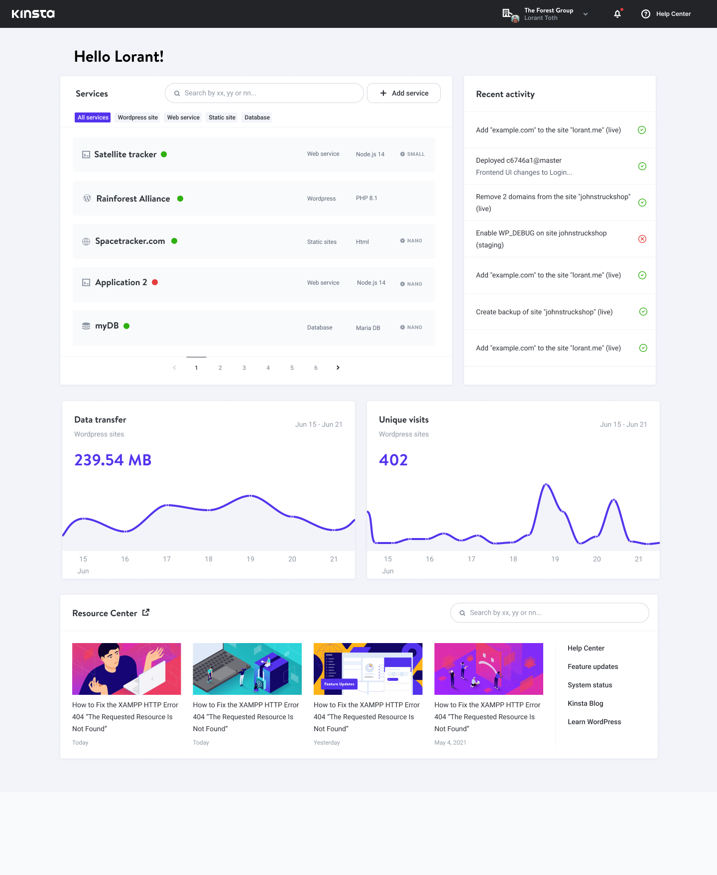
This direction gives the service table more horizontal space and adds type filters. The table brings technology, resources, and preview links into a consistent row, while recent activity occupies a separate panel alongside it.
Dated charts for data transfer and unique visits sit below the operational overview. The page now reads as a sequence: find a service, understand recent changes, then inspect usage over time.
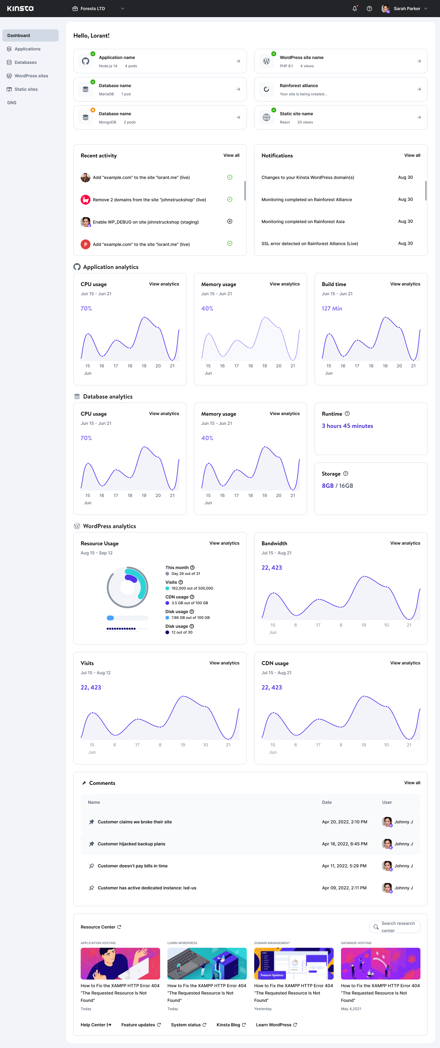
The frame labeled “V5 (Alpha Release)” brings back the persistent left navigation and uses compact service summary cards at the top. Recent activity and notifications become distinct areas, separating changes in the account from messages that may need attention.
Analytics are grouped by Applications, Databases, and WordPress, with metrics suited to each service family. The resulting page is more extensive: it accommodates different hosting products while keeping services and activity above the detailed charts.
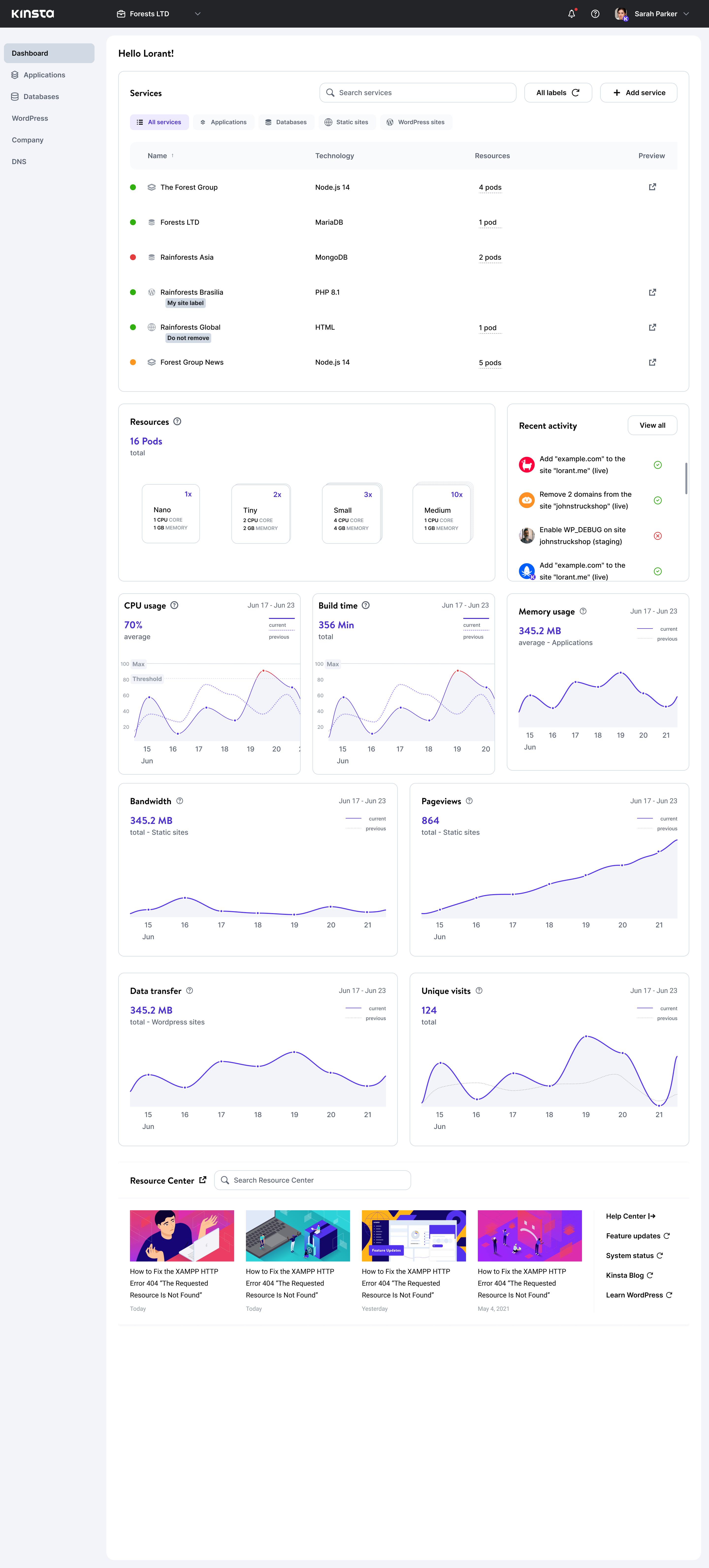
The beta direction combines a searchable service table with explicit pod counts and a resource summary grouped by size. Recent activity sits beside the resource inventory, bringing account changes into the same overview.
Usage charts add previous-period comparisons and reference lines for limits and thresholds. The layout connects what is running, the resources it uses, and how that usage changes over time.
Dashboard design
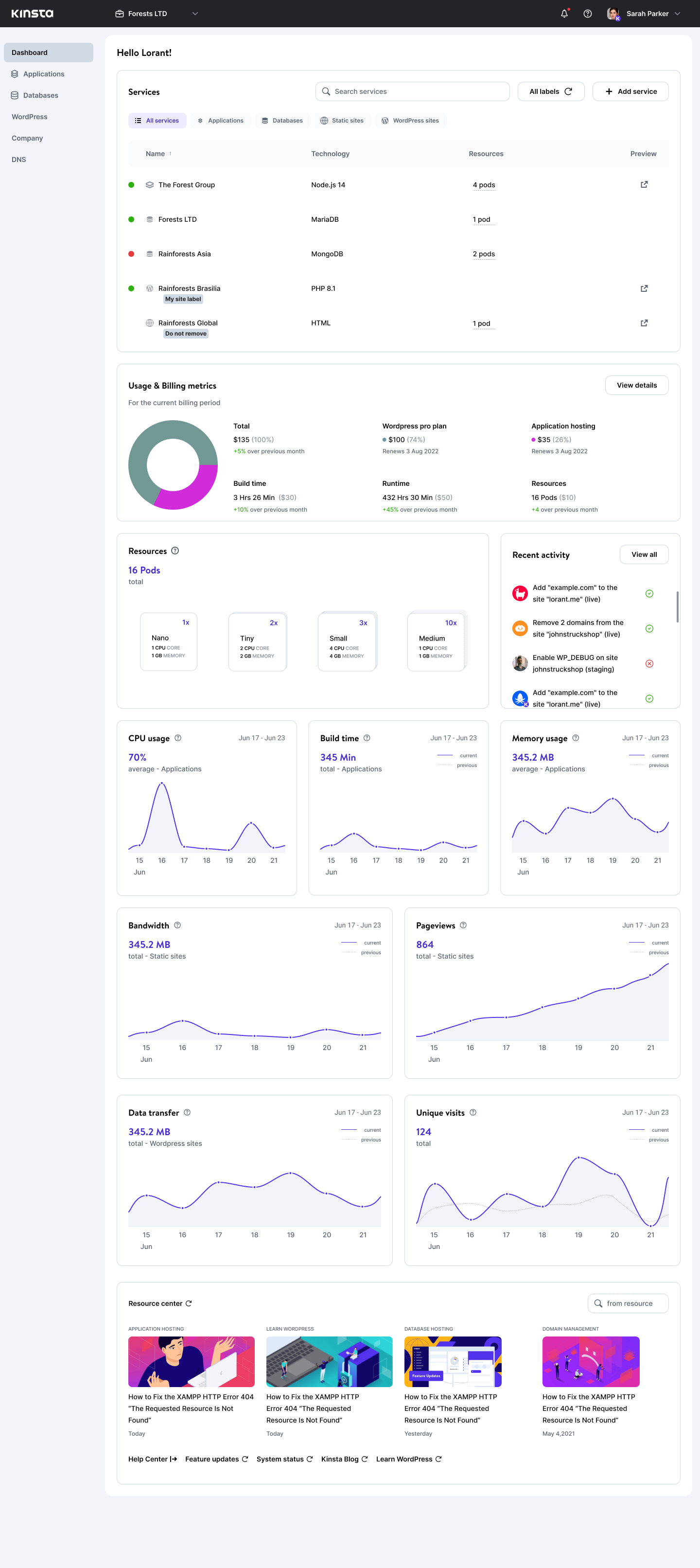
Services, activity, and usage in one overview
The dashboard concept brings the service list to the foreground. Developers can search and filter services, check their status, and start adding a new service from the same area. Recent activity provides context for changes across the account.
Usage charts sit below the service list, while a resource center offers documentation and support. The aim was to make everyday monitoring easy to scan while keeping guidance available.
Dashboard concept: services and activity above usage metrics and supporting resources.
Key decision 01 · Pod visualization
Make the resource model explicit
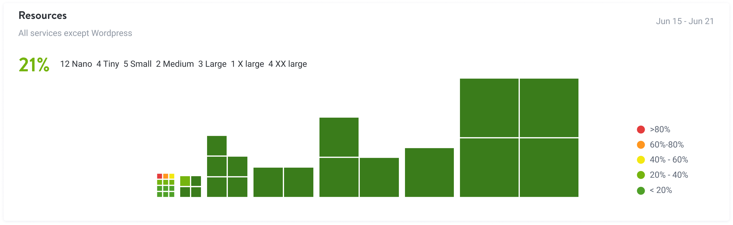
A pod is an abstract unit of infrastructure. A utilization picture can show a pattern, but it does not necessarily explain how many pods exist, which sizes they use, or what CPU and memory each size provides. The explorations below move from utilization patterns to explicit specifications and a visual representation of quantity.
01 · Utilization blocks
Earlier exploration — utilization blocks. Color and block size emphasize usage across the pod inventory. The legend connects color to utilization ranges, while different block sizes distinguish resource sizes.
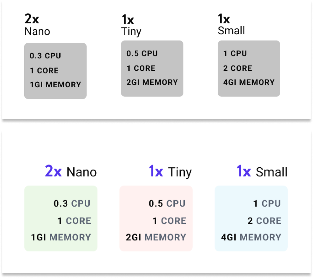
02 · Specification cards
Make capacity easier to compare. These two card explorations put pod counts beside Nano, Tiny, and Small labels, with CPU, cores, and memory inside each card. The second treatment separates the sizes with subtle color.
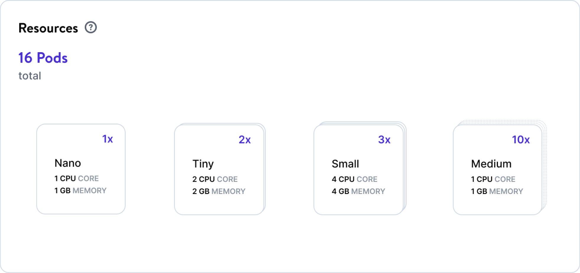
03 · Stacked cards
Make the count visible in the form. A total pod count leads into Nano, Tiny, Small, and Medium cards with counts and specifications. Stacked card outlines reinforce the quantity visually, while numeric labels preserve an exact count.
The design tradeoff: a dense utilization graphic emphasizes patterns; labeled lists and cards emphasize identity, quantity, and capacity. Keeping those questions distinct makes the resource model easier to explain.
Making resource usage traceable
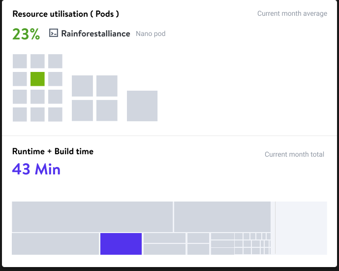
A resource overview is more useful when it can point back to the service behind the number. This hover-state exploration highlights one application across resource utilization and runtime/build-time views, while the other areas recede. The service label and pod size give the selected segment context.
A designed hover state connects the same service across two resource views.
Key decision 02 · Graph context
A trend needs a reference point
The graph explorations in Section 2 add context to the same memory-usage pattern. Each reference answers a different question: whether usage has changed, how much capacity remains, when attention may be needed, and how a point compares with typical usage.
Previous period
Has usage changed?
A second time series compares the current pattern with the previous period. The hover exploration adds values at a specific point.
Maximum limit
How close is capacity?
An upper reference line locates the usage curve relative to the available ceiling.
Threshold
When does usage need attention?
A threshold marks an attention point within the chart, distinct from the maximum limit.
Average
What is typical?
An average reference makes peaks and dips easier to read against a baseline; another exploration combines average and threshold.
The design tradeoff: additional reference lines make the chart more informative, but they also compete for attention. Clear labels and distinct line treatments help separate historical comparison, capacity, and warning signals.
Connecting consumption to billing
The Usage & Billing direction brings estimated costs, hosting categories, build time, runtime, and allocated resources into one area. It explores the relationship between what an account is using and what that usage costs, rather than asking users to piece those signals together across separate screens.
Further down, current and previous-period chart series add a comparison point for CPU, memory, traffic, and other metrics. Together, these explorations address two different questions: “What am I using?” and “How is that changing?” The amounts and percentages shown are interface examples.
View the usage and billing explorationUsage, costs, and historical comparisons explored within the dashboard.
Explaining application relationships
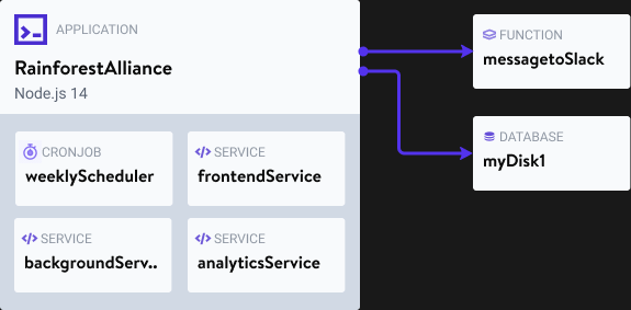
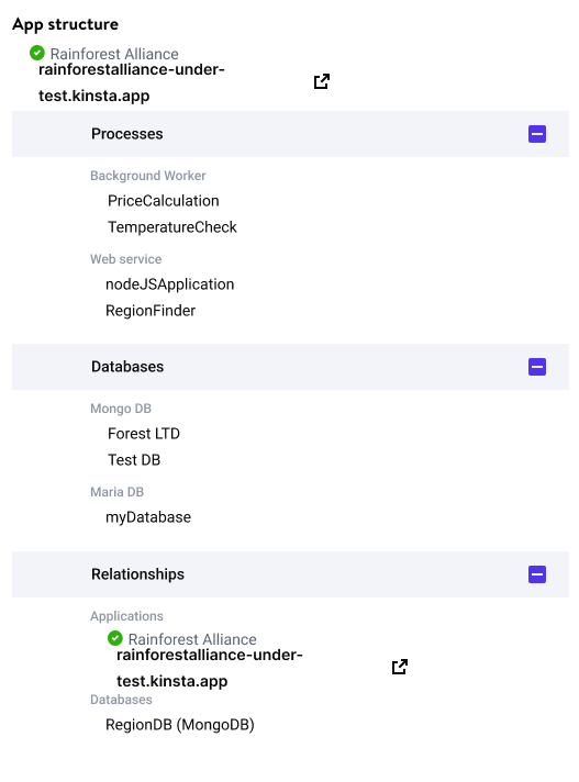
An application can contain several processes and depend on other services. The relationship diagram makes that model visible by grouping internal components and showing their connections to a function and a database.
A relationship-diagram exploration distinguishes application components from connected services.
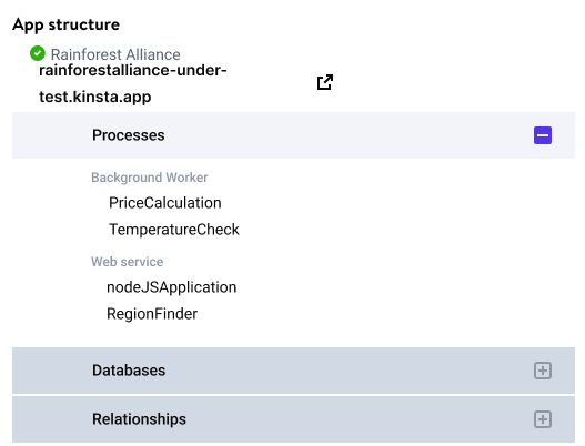
The tree explorations express the same need through progressive disclosure. Process types sit under the application; databases and relationships can be expanded when needed. Comparing the two states shows how the overview can stay compact while retaining access to a more detailed structure and direct links.
Compact state: processes are visible; other groups remain collapsed.Expanded state: databases and connected applications are revealed.
Usability testing
Testing what developers could find and do
Usability sessions checked whether users could complete activities, what they liked, and what felt missing. Feedback described the interface as easy to use and services as easy to find.
Participants discussed resource-level metrics more than application-level metrics and raised signing up through Git services. Those observations gave us concrete areas to revisit in monitoring and customer activation.
Customer activation
Reducing friction before the first deployment
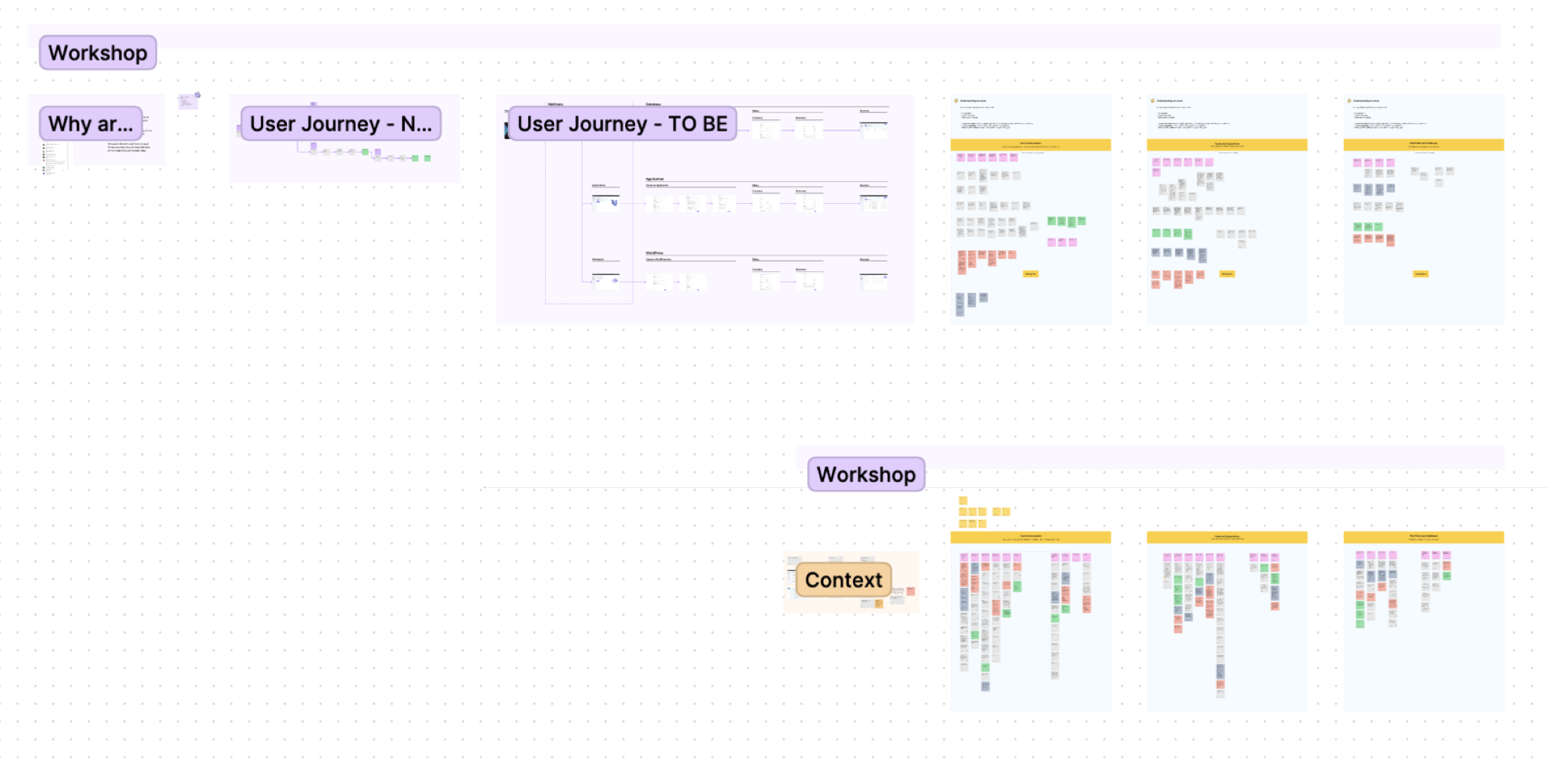
My work extended to onboarding, credits, a cardless trial, and Git single sign-on. Activation workshops mapped the existing journey and explored how users could move from signing up to trying a service.
Workshop exploration of the journey from signup to using a service.
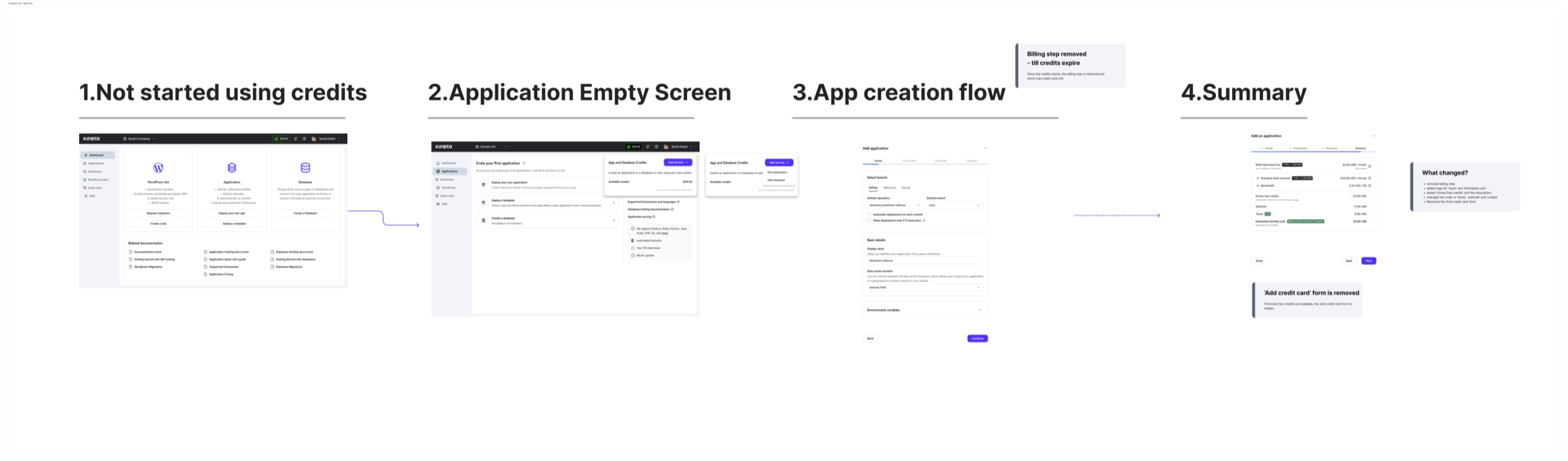
The cardless-trial flow made available credits visible and removed the credit-card step while credits remained. The design connected the empty state, application creation, and cost summary so users could understand their next step and the resources they were selecting.
The proposed flow kept credits and cost information visible through application creation.
Design system & delivery
Consistent components and clear handover
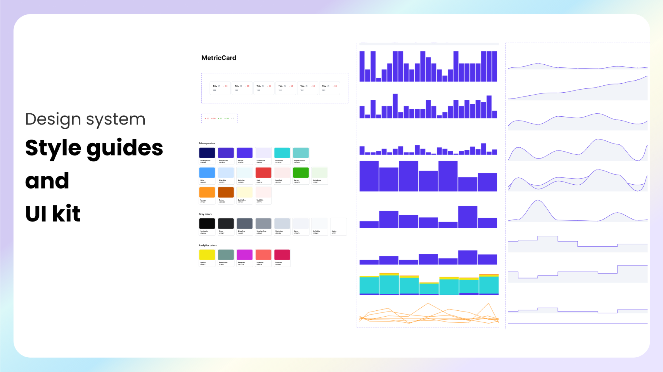
I worked with Lorant on the design system, Peter on review and feedback, and Csaba on product vision and goals. Shared styles, metric cards, and chart patterns supported consistency across the dashboard and related screens.
Shared styles and UI components used across the dashboard work.
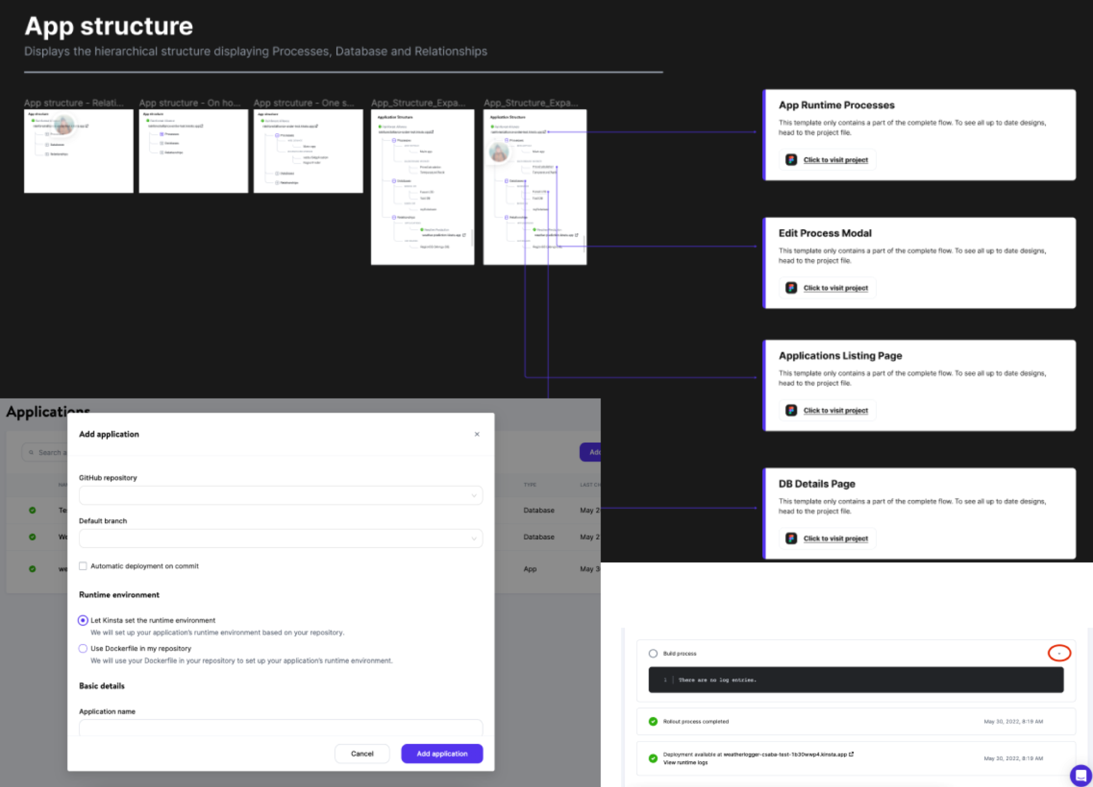
Handover materials documented acceptance criteria and annotations alongside application structure and deployment interactions. The work accounted for deployment in progress, failure, success, and suspended applications.
Handover examples connecting application structure, interactions, and implementation details.
Outcomes
Reported results from the Kinsta work
The project presentation reports a 23% increase in signups, an NPS of 80, and a 4.9/5 rating on Product Hunt.
23%
Increase in signups
80
Net Promoter Score
4.9/5
Product Hunt rating
Historical results reported in the project presentation. Measurement periods and sample sizes are not specified; these figures describe the broader product work and are not attributed to the dashboard alone.
Reflection
A dashboard needs a shared understanding of the product
This work connected domain learning, customer research, and interface design. The service hierarchy and deployment states were as important as the visual layout: without them, the overview could not explain what was happening.
Testing also showed why the dashboard and onboarding needed to be considered together. Developers needed both a clear path into their first service and useful information once that service was running.