Nike Brand Bookshelf
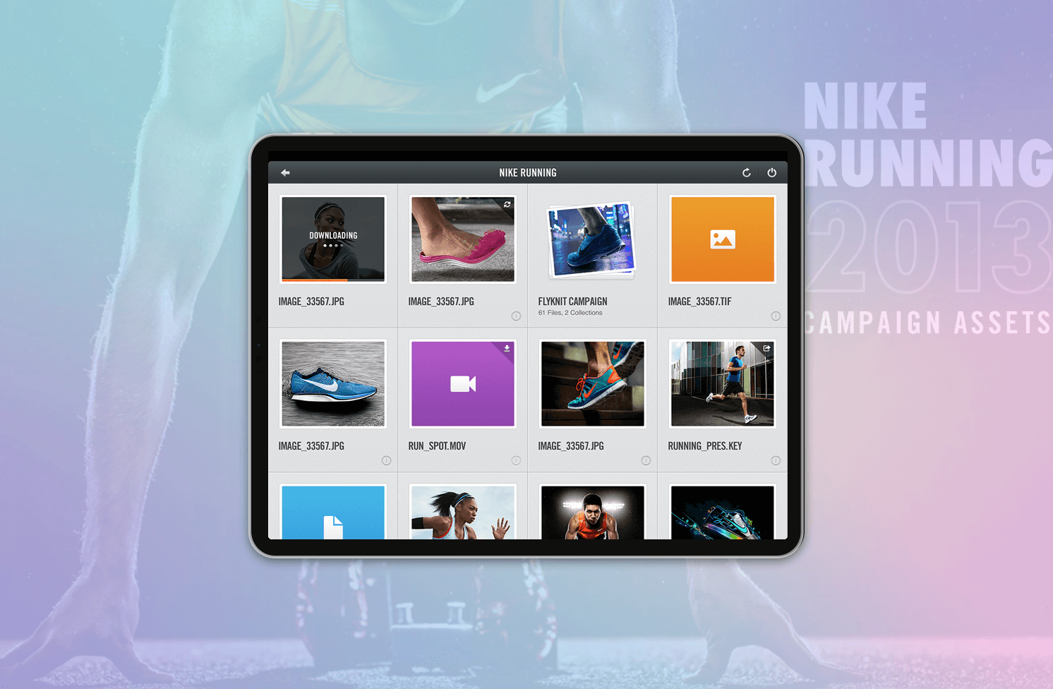
Marketeers from Nike are always on the run. They meet multiple clients in day and shuffle tons of documents to prepare for the presentation while accessing secured updated content on cloud.
I was part of this exciting project to develop an iPad app to enable seamless access to content.
My role
I worked as an interaction designer along with a visual designer (Mahesh) to craft the user experience keeping the Nike brand guidelines in mind. We had the creative freedom to work on micro-interactions and explore various modes of interacting the content on the relatively new medium ( iPad ).
THE CHALLENGE
Easier access to content
Nike’s marketing team uses iPads to access, retrieve, download and present the branding material for various purposes.
While iPads make it super comfortable to carry around, one of the major challenges is the limited memory.
Also, there is a variety of content being stored and had to make it usable for the users to identify and access the files.
There would be simultaneous requests to retrieve the files from the cloud and this would make the downloads slow.
So arose the need for offline access.We had to reflect the upbeat and sportiveness into the interaction.
THE APPROACH
Practicing agile
After several calls with the client ( Nike ) and several more calls with the Project Manager, I understood the persona and the user scenarios. We followed Agile methodology and had several Scrum meetings to assess the complexity of the stories and tasks. I took to pen and paper to sketch the user journey and different states of the interaction. My initial wireframes were received well and I worked on several iterations of the visual designs.
DISCOVERY
Go by the brand language
Moodboard for the visual direction
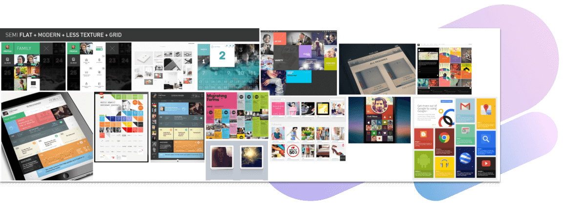
We knew we wanted to go for a tile interface, because it is a folder structure and the ease of access is important.
Also there are many states for each folder to be shown.
VISION
Truly reliable
We knew we wanted to go for a tile interface, because it is a folder structure and the ease of access is important.
Also there are many states for each folder to be shown.
PRODUCT
Introducing
Nike Brand Bookshelf
THE FRAMEWORK
How we got there
Initial sketches and wireframes
After discussing with the technical team and project manager from the scrum meetings, the Epics and Stories were identified.
Some of the key workflows were to :
- List the files
- Keynote viewer
- PDF reader
- Manage downloads
- Offline content viewing
Then I started sketching the user flows and possible screen flows for each of the Stories.
SCENARIOS
Secured Access
File Folders
Wireframes exploring options for the file folders
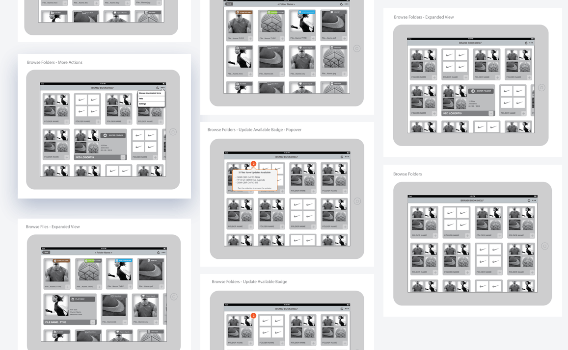
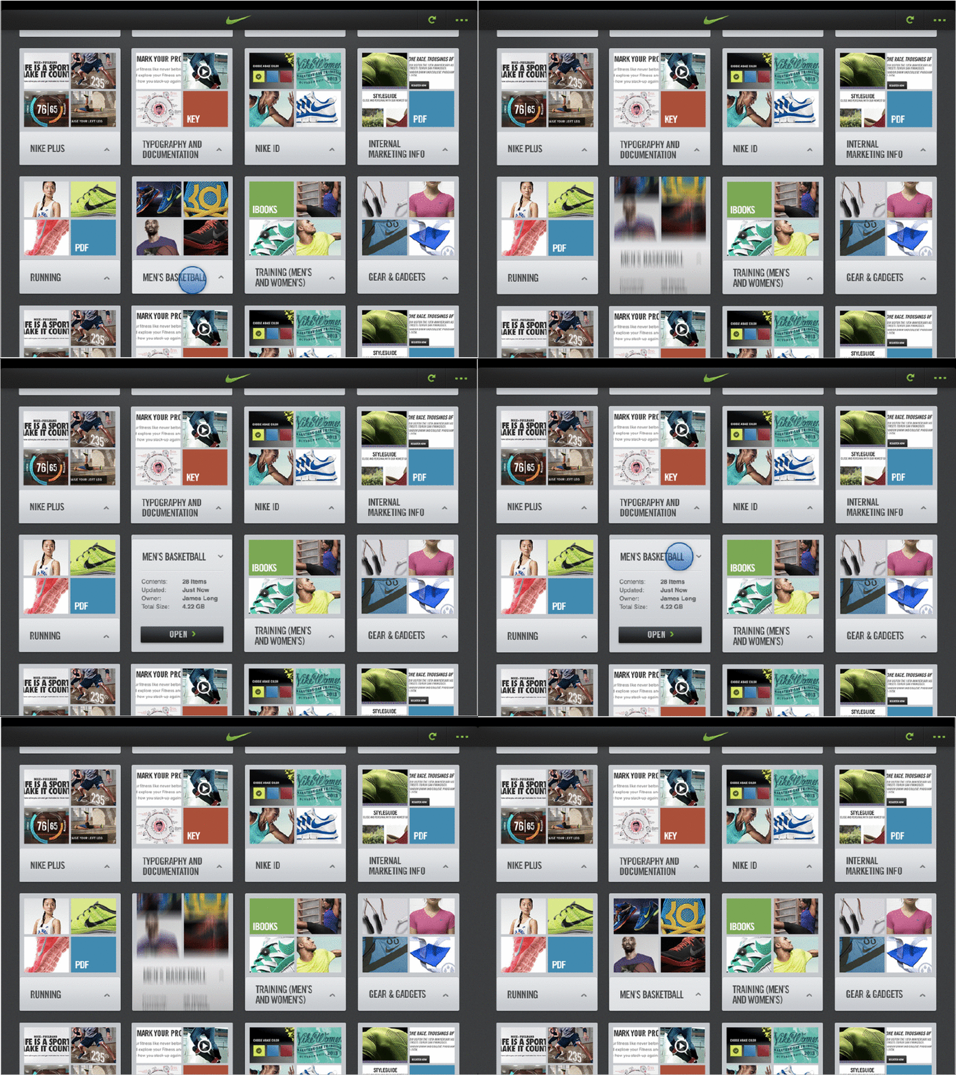
Whenever there is an updated file, a notification appears on the folder. The user can download a newer version and it will be queued.
Managing Downloads
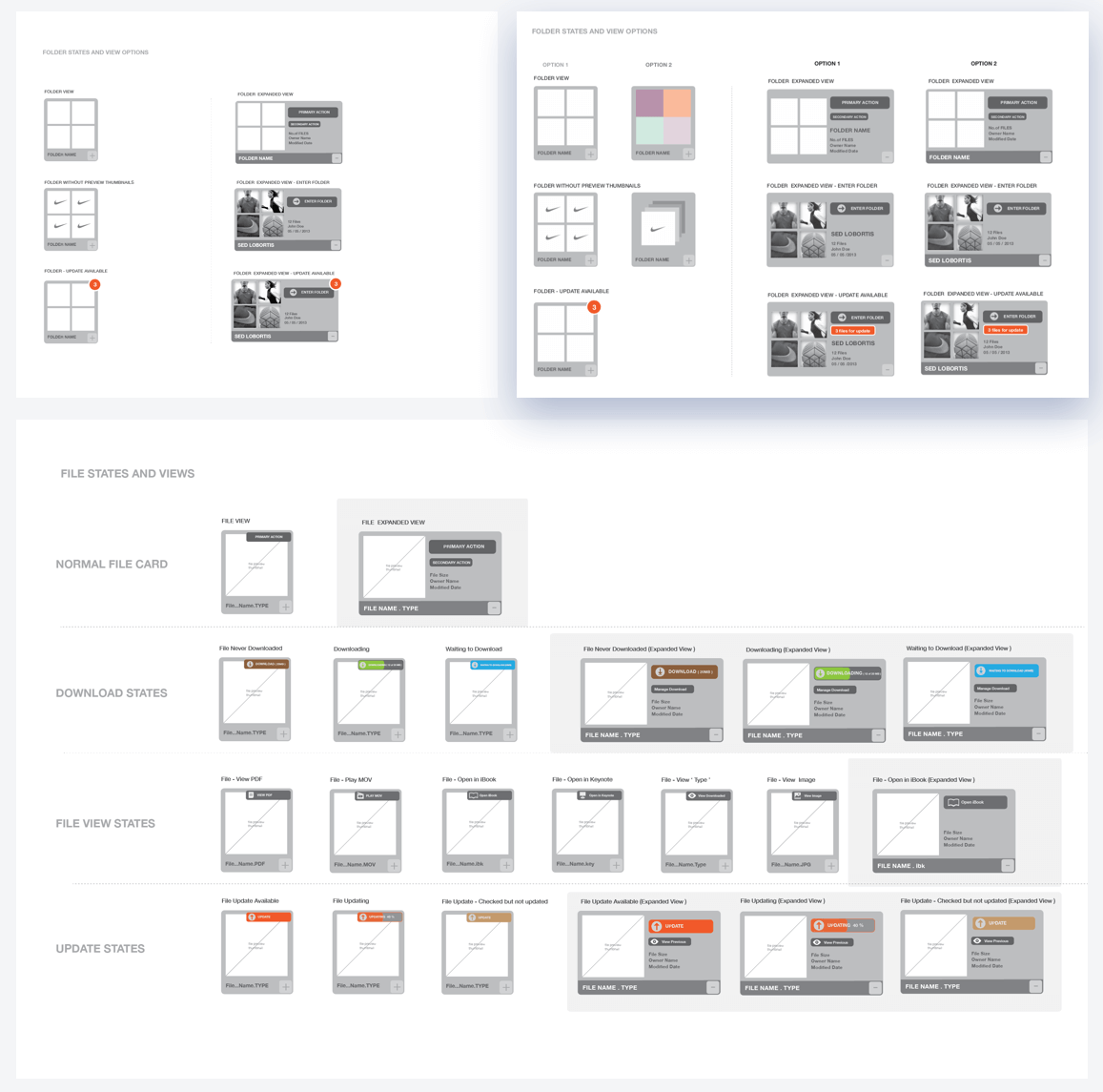
Measuring the pros and cons of each type of representation gave a lot of clarity in our approach.
However, we had to go with stack representation because it was visually less cluttered and gave easy access to folder actions.
Each file has multiple states based on whether there are updates or whether it is being downloaded or is currently downloading etc.
Working Offline
The folders mainly consists of keynote files, PDFs and movie files used by the marketing people.
Keynote and PDF viewers had to be custom built internally on the app.
So I got the opportunity to think from ground up and design interactions for the Keynote and PDF viewer.
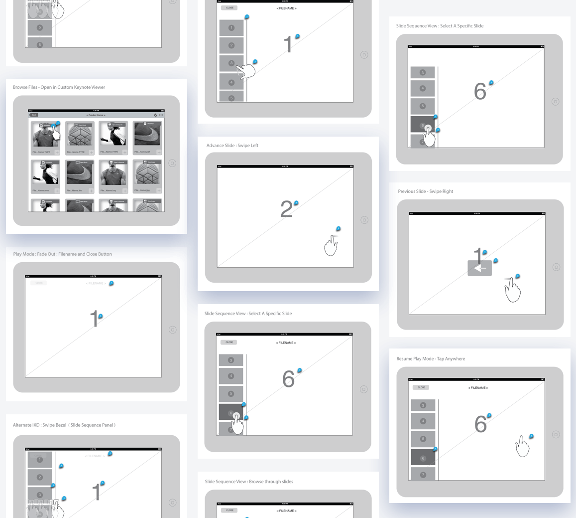
I sketched the detailed interaction to play, advance, pause, and resume functions of the slideshow. Also the page scroll function for the pdf reader.
Presenting Keynotes
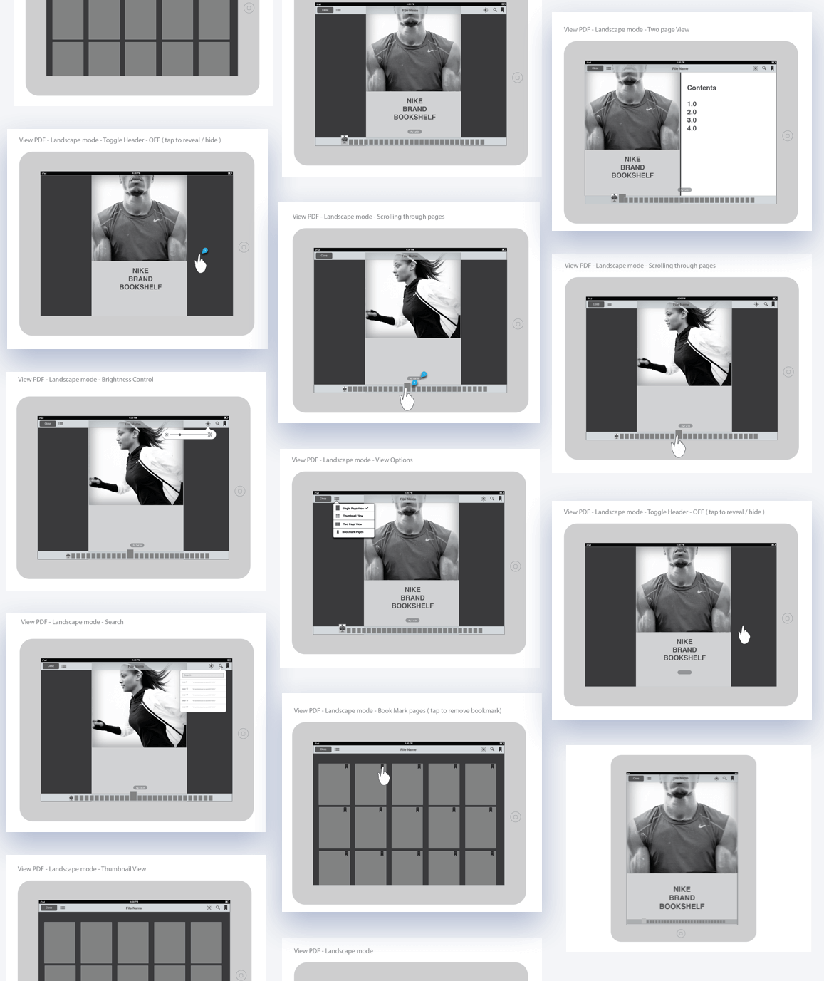
PDF viewer has functions like page view, brightness control, scroll etc which we thought is useful to the users.
Viewing PDFs
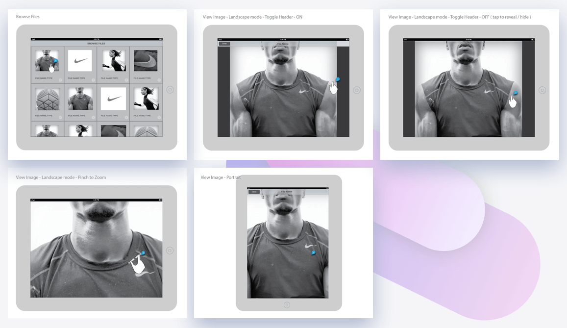
Image viewer interactions
Viewing Multimedia
THE FINISHING
Detailed Design
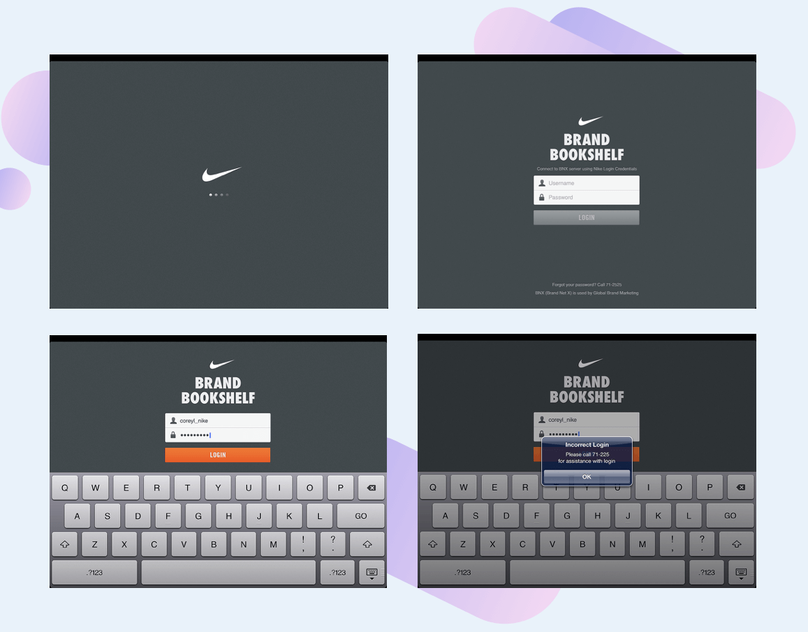
Login Screens with user id and password entry flow
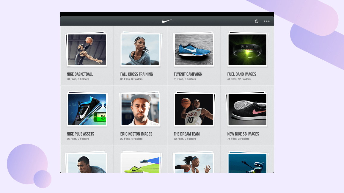
The file folder view after logging in
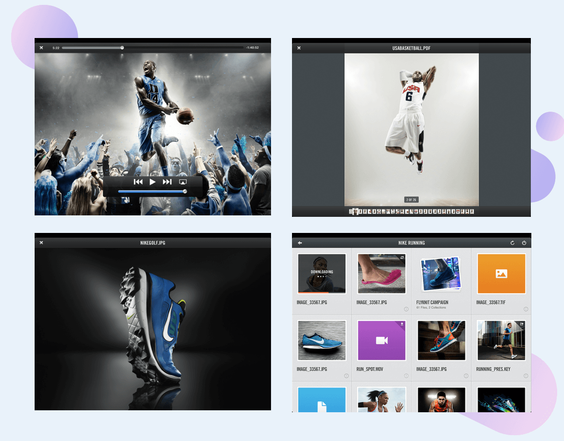
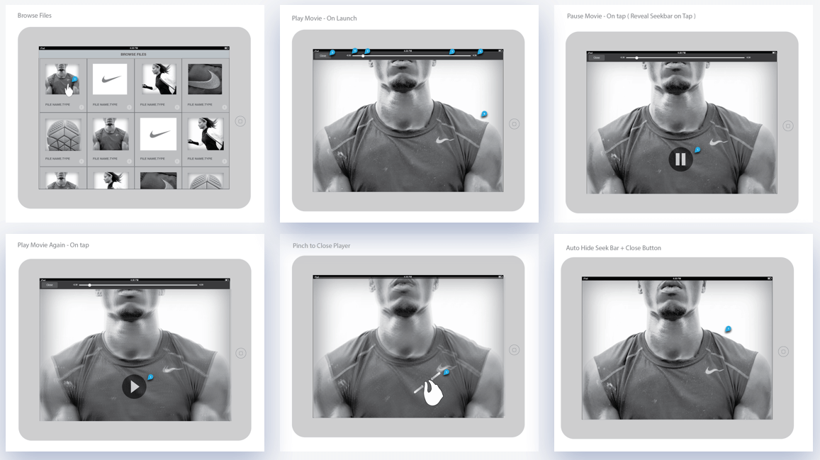
PDF reader, Image viewer and Movie player. If thumbnail previews are not generated on the folder view, icon placeholders are loaded.
Apart from the above scenarios, we had to design multiple cases of Offline viewing, Managing downloads, Queing etc.
There were number of decisions made from the User Experience point of view.
We also tried to improve the application by iterating on the visual nuances and micro-interactions.
IMPACT
Using the product
The app was delivered to the customers and it was well recieved.
Thourough User-Testing was done by the delivery team in the US.
We had couple of weeks to fix technical and UX bugs.
Nike appreciated our teams work ( design and technical ) and also gifted a pair of Sneakers for the entire team 🙂